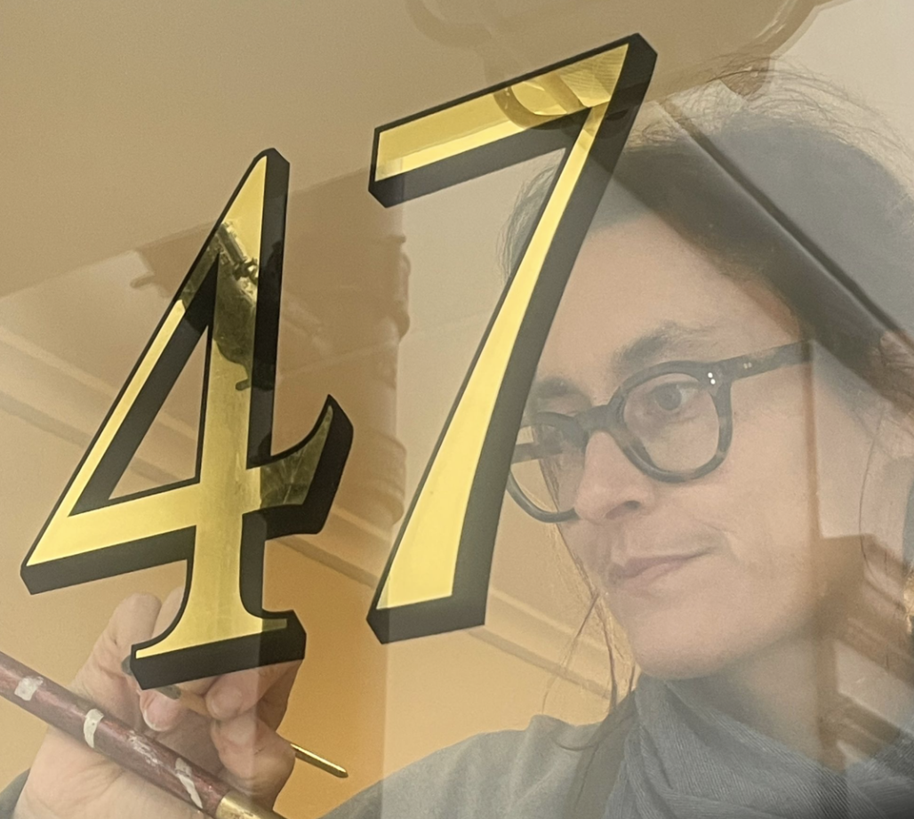
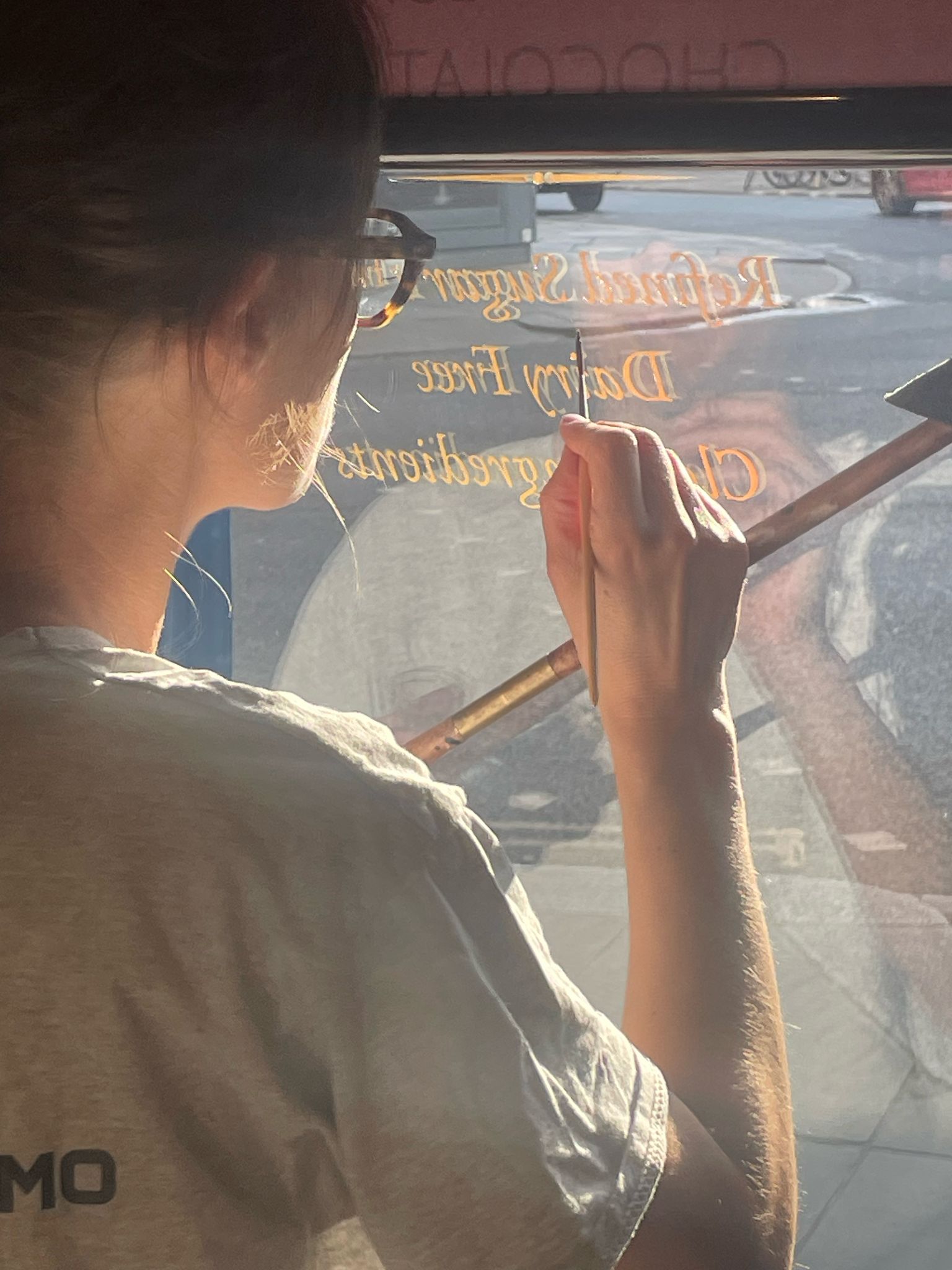
The Next New Black? Old School NGSeraina colour mastery.
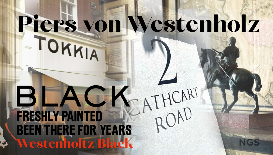
Meeting Piers Westenholtz in 1985 was an instatly fascinating experience. He wanted me to restore an ebonised painted chase lounge sofa frame.
”Here’s the recipe for the antique black mix guys…”
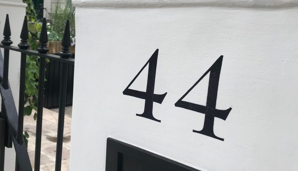
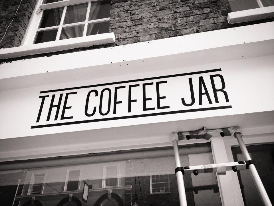
Decades later we still use his enbonised Black mix with a few additions of our own. What it means is our freshly painted numbers and letters across town look immaculate because of Pier’s incredible eye for colour, and yet appear to have been there for years.
New Black and Antique Black
The terms “New Black” and “Antique Black” often refer to specific shades or finishes used in various artistic, decorative, and restoration contexts. While both hues are rooted in the color black, their application and visual characteristics differ significantly.
New Black
“New Black” typically denotes a modern, fresh interpretation of the color black. It is characterized by a deep, pure hue with minimal undertones, offering a sleek and contemporary appearance. This shade is frequently employed in modern design, signage, and furniture to evoke sophistication and elegance. Its uniformity ensures a clean, crisp finish that complements minimalist aesthetics.
Application in Restoration and Design
The choice between New Black and Antique Black hinges on the desired aesthetic effect:
- New Black offers a modern, pristine look suitable for contemporary settings.
- Antique Black provides an aged, historical feel ideal for vintage or rustic designs.
Summary
| Aspect | New Black | Antique Black |
|---|---|---|
| Appearance | Deep, pure black | Aged, weathered black with undertones |
| Usage | Modern design, signage | Restoration, vintage aesthetics |
| Visual Effect | Sleek, clean | Rich, textured |
Understanding these distinctions allows for precise application tailored to specific artistic sign branding or restoration projects.
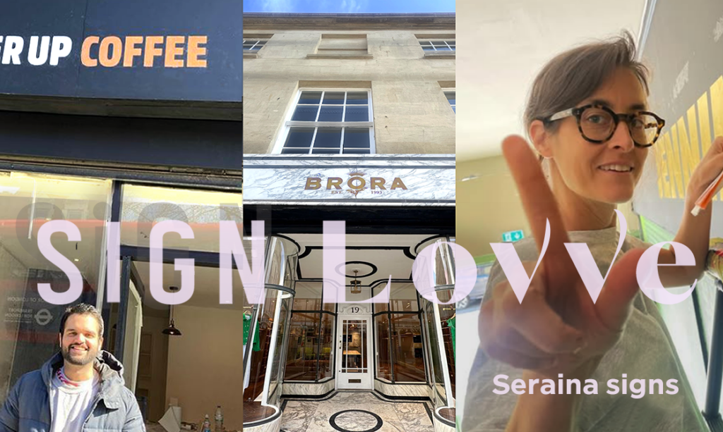
The New Black is? – SERAINA SIGNSMITHS LONDON. Shady secrets and other painted delights.

About Seraina Baum G, the complete Traditional Sign Writer Profile
BIG PAGE INTRO Seraina Baumgartner, the complete Traditional Sign Writer. A comprehensive biography …

Trad Twist mix of Soho Retro Signs: Fall in love – it’s magic.
The Fab Trad Modernista Mix From Coolest New Minimals, to the Warmest Flowing Classics. WE GOT YOU. …
The New Black is???
The Next New Black? Old School NGSeraina colour mastery. Meeting Piers Westenholtz in 1985 was an in…
3 Recent Restoration Projects
1: Rigby Gun Makers Rigby Gun Makers of London have a distinguished history that dates back to the e…
TOKKIA London
View this post on Instagram A post shared by Nick Garrett (@ngs_signwriting_london) TOKK…

Seraina signs: Restoration signwriter
CASE: Rigby Gunmakers broken glass replacement sign, London Restoration Signpainting Founded in 1838…