Read time 7-10 min
The Fabulous Trad Modern City Mix
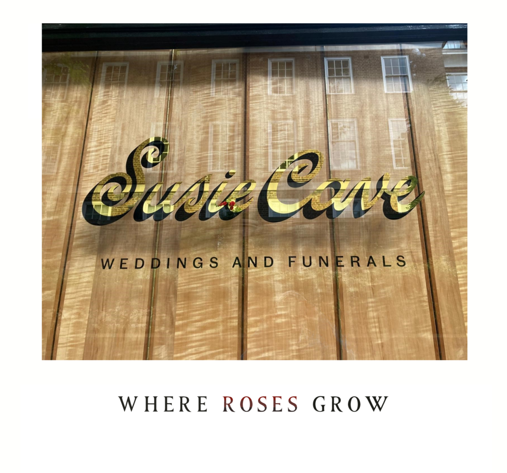
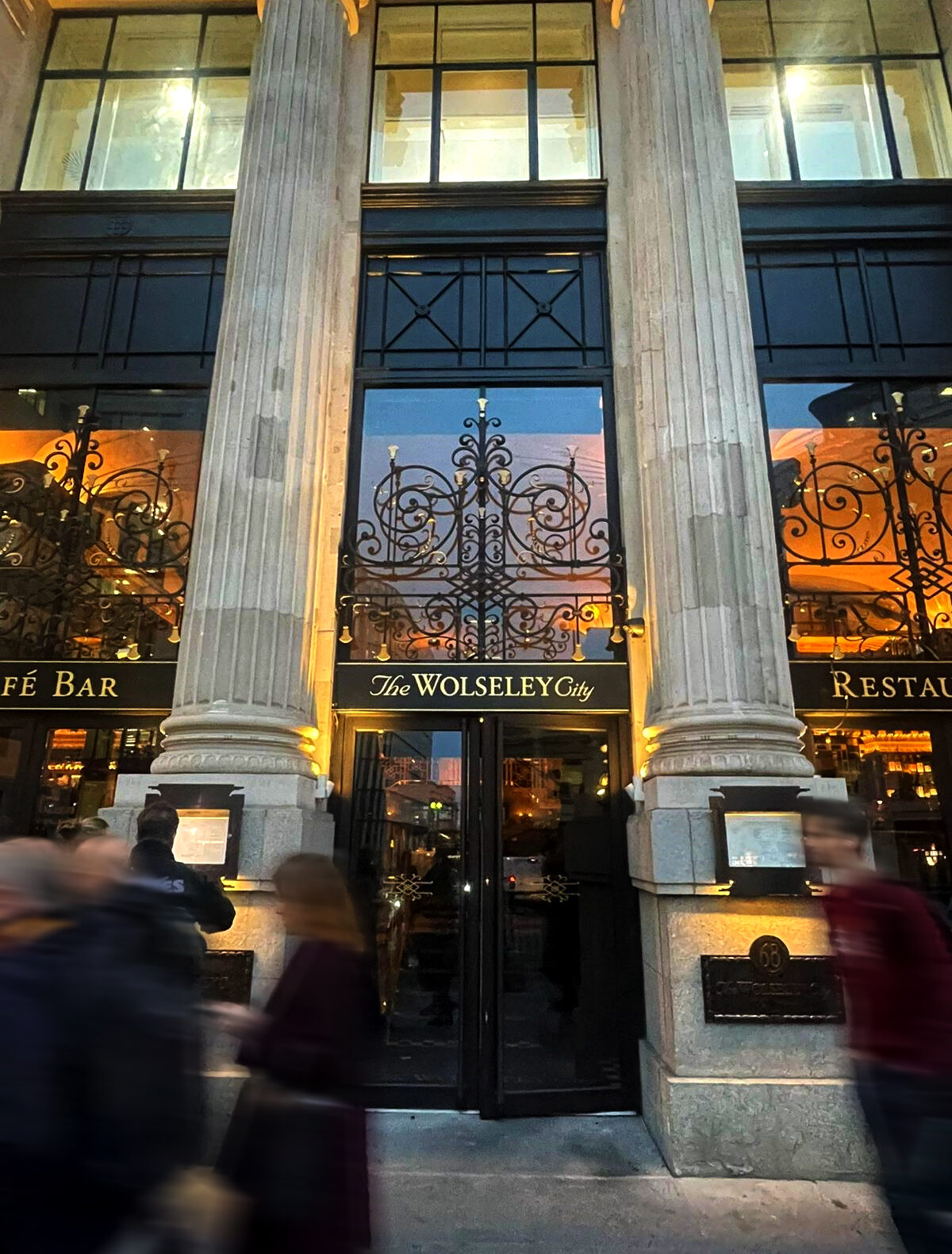
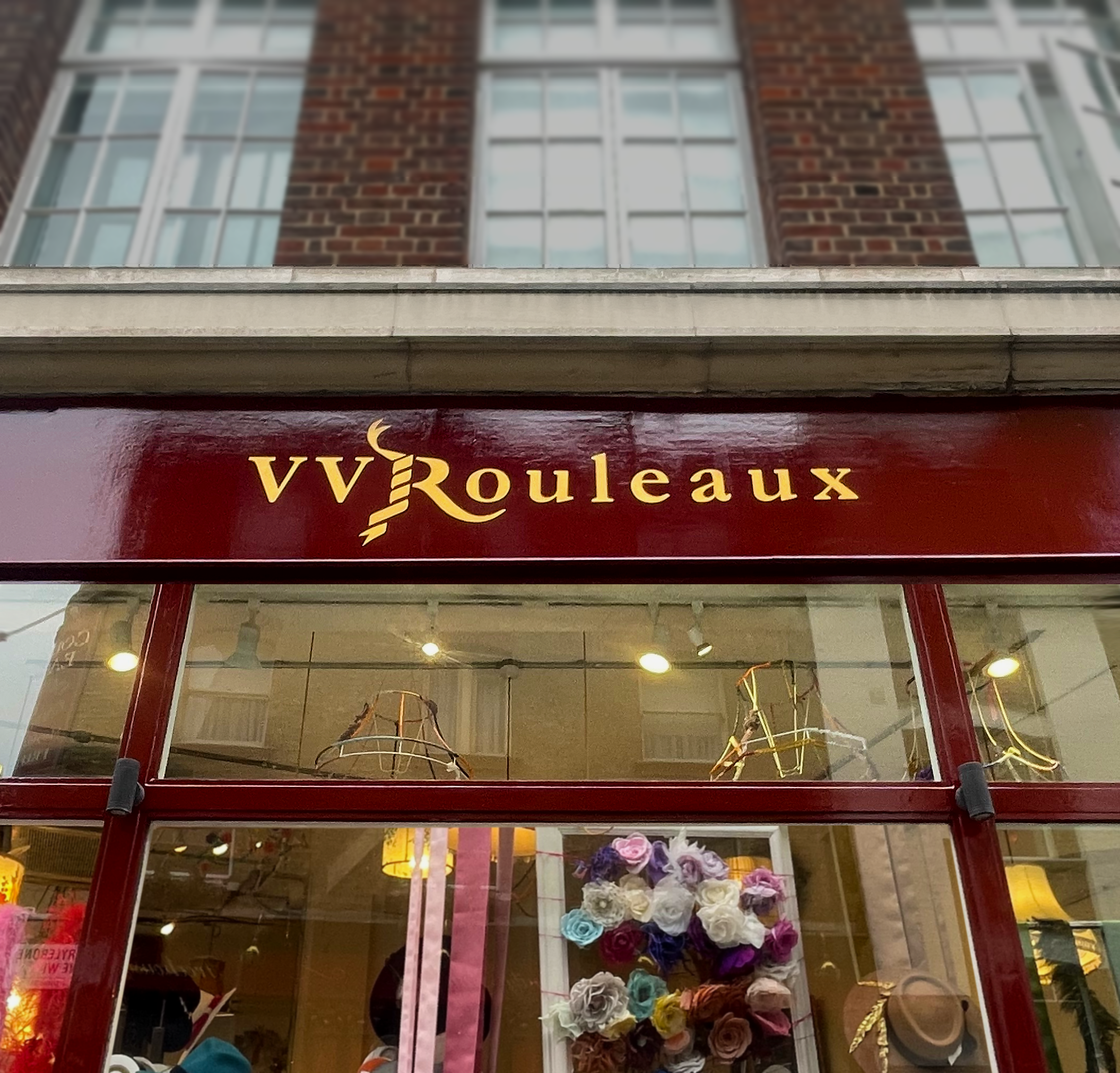
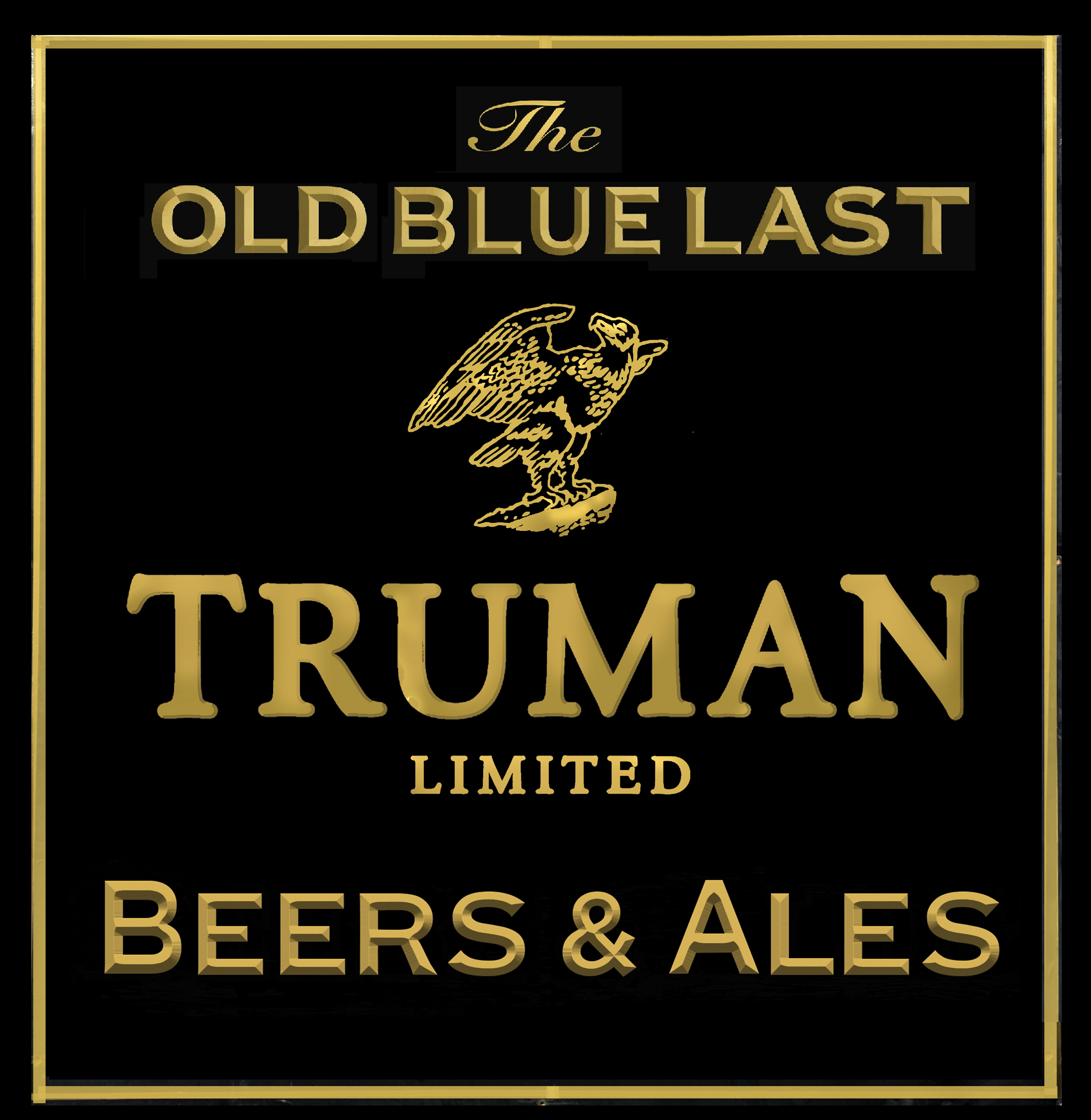
Introduction: Trad Twist mix of Soho Retro Signs.
Inspired by the spirit of iconic lettering artists and typographers such as Edward Johnston, Eric Gill and Alan Fletcher, Trad Twist celebrates the meeting point between traditional craftsmanship and expressive urban typography. As Johnston famously wrote, “Roman capitals hold the supreme place among letters for readableness and beauty” — a philosophy that continues to inspire the balance, clarity and character behind every sign.
Drawing influence from the vintage shopfronts of Soho, classic café signs and mid-century London lettering, these hand-painted signs combine retro style with a fresh contemporary edge. Echoing Eric Gill’s belief that “Letters are things, not pictures of things,” every piece is carefully crafted with a strong sense of proportion, materiality and architectural presence — designed to complement interiors, façades and public spaces with timeless character and understated elegance.
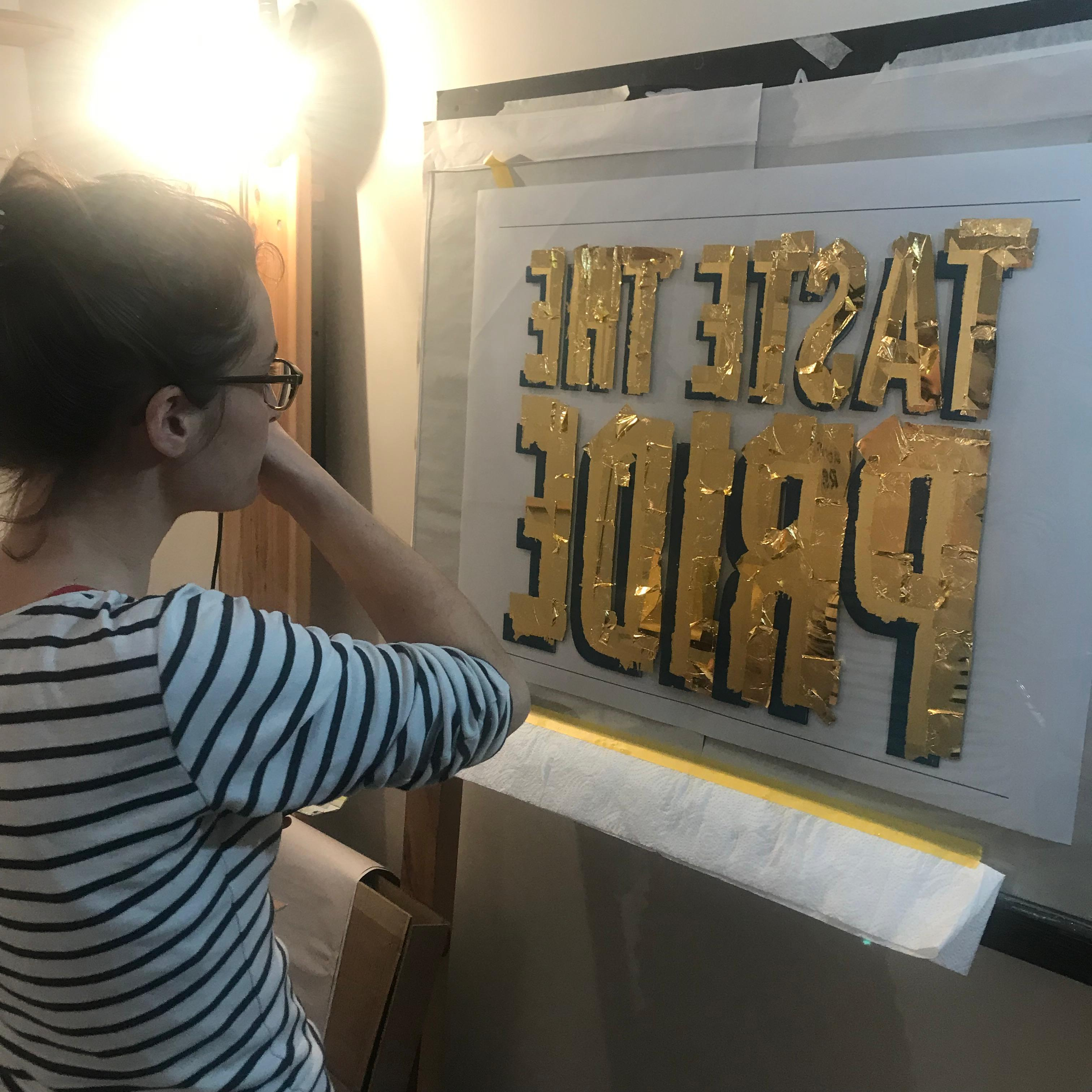
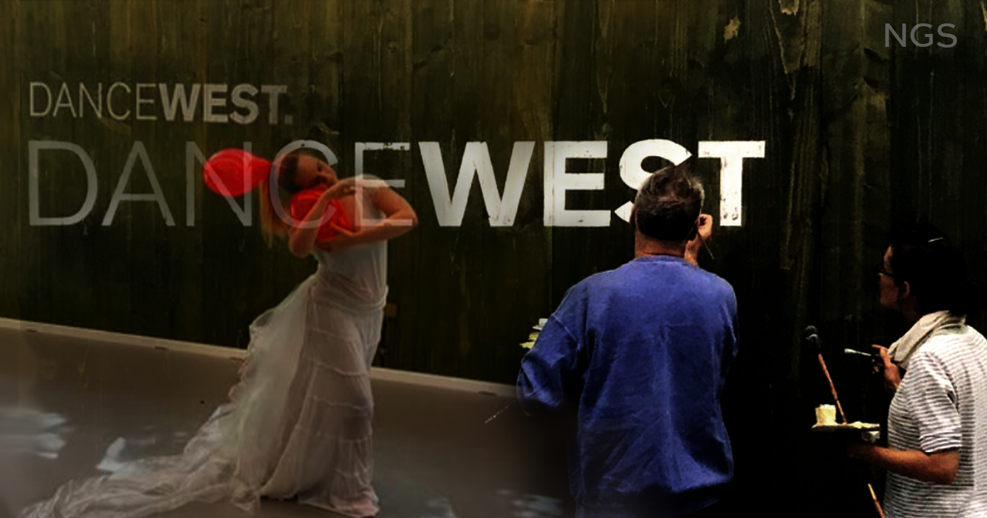
From Coolest New Minimals, to the Warmest Flowing Classics.
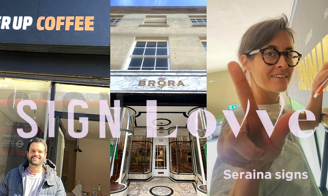
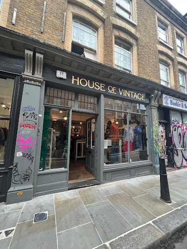
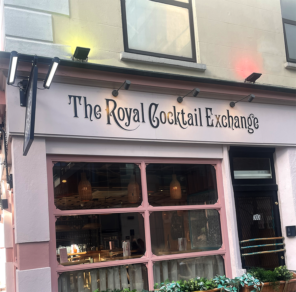
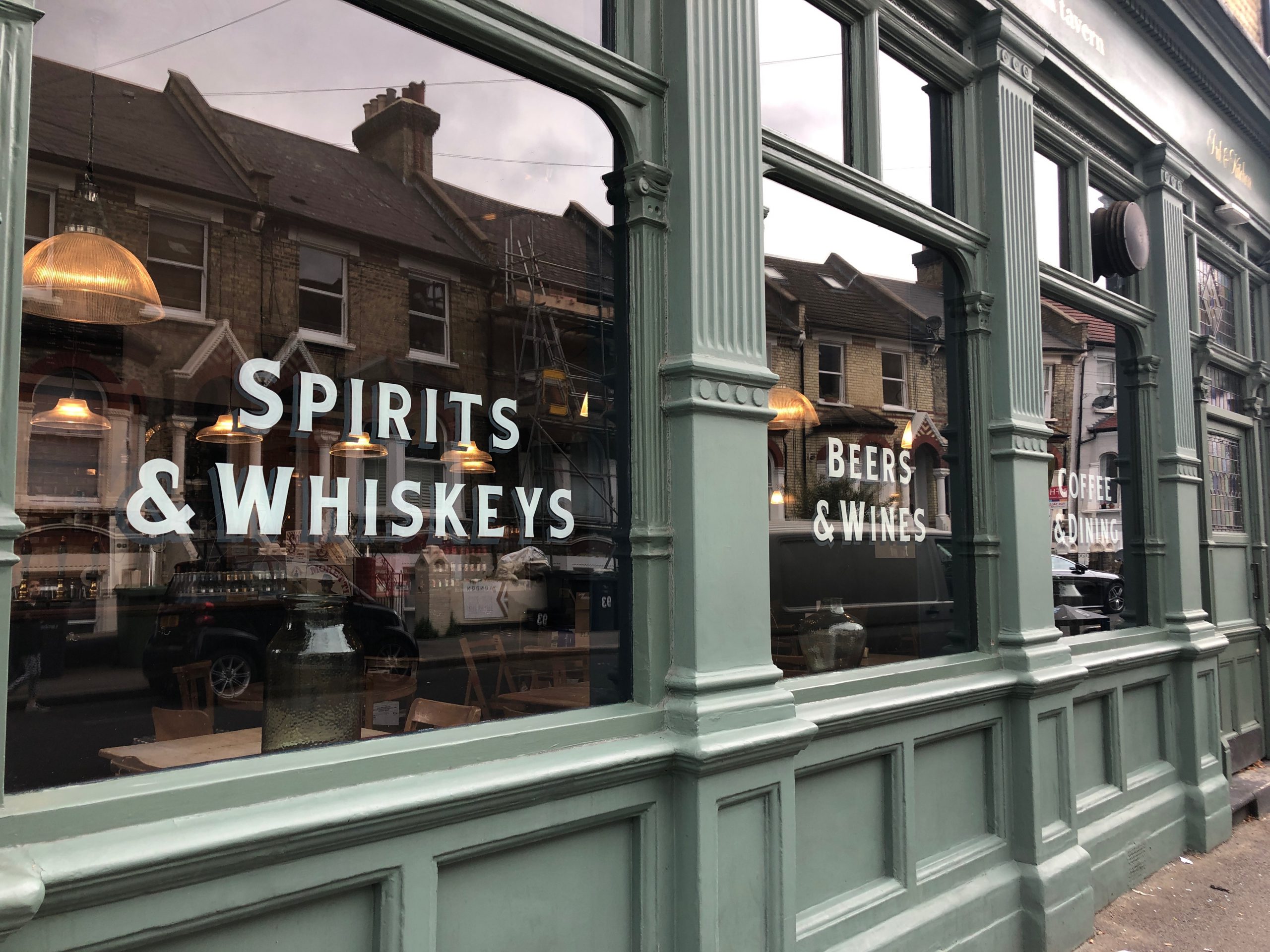

PUKKA URBAN BOLD TYPE
SOHO TO SHOREDITCH
The Coolest Top Brands trust our solid state ‘Knockem dead’ Sans Serifs and pure design experience.
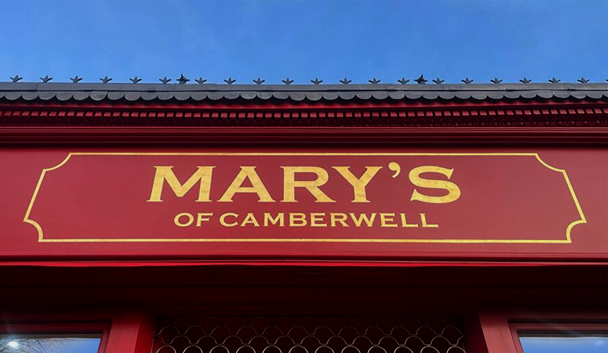
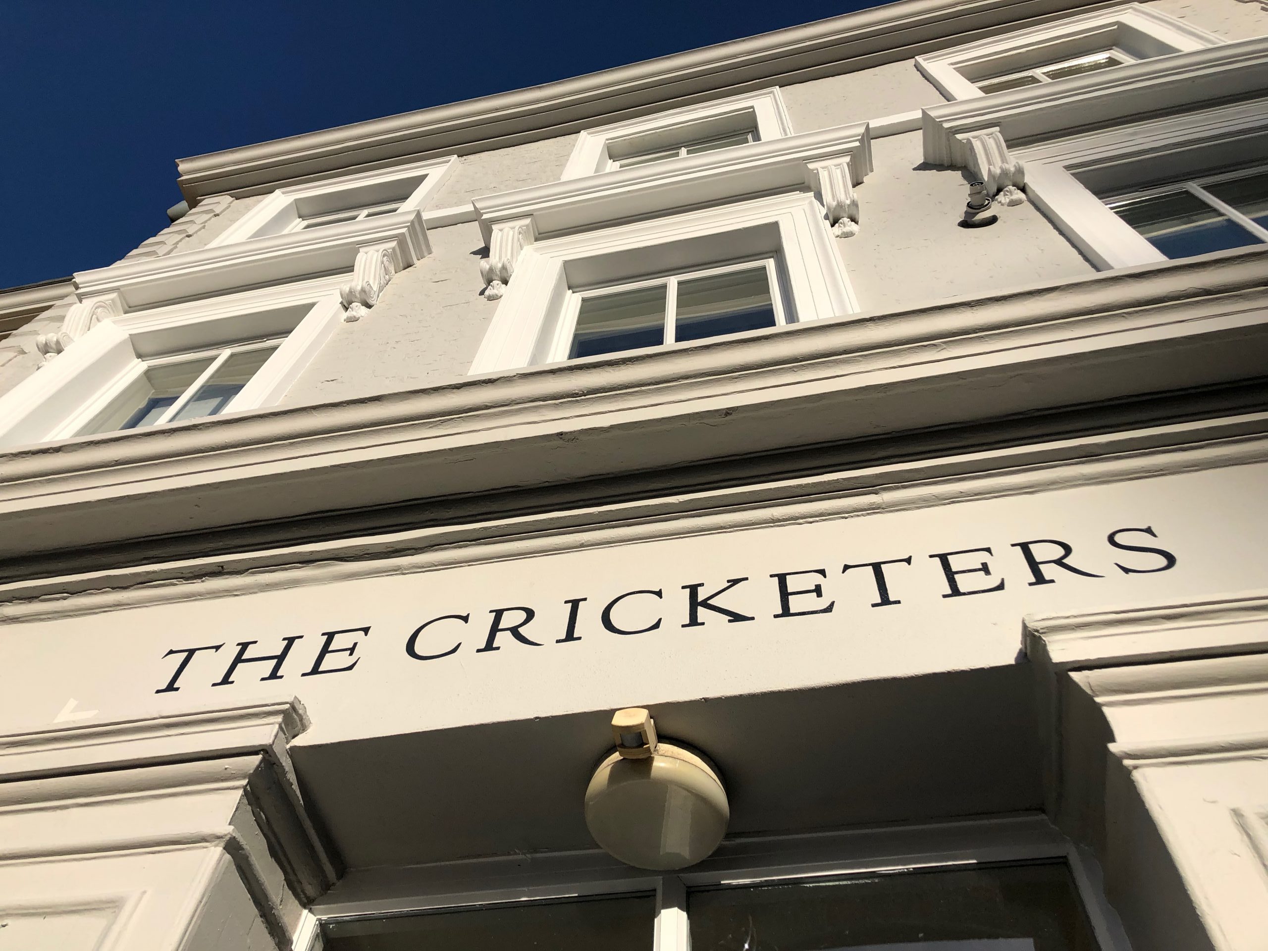
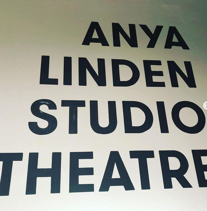
EASY LONDON SANS
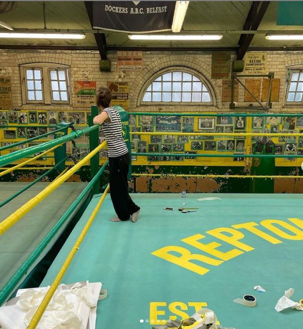
Magnificent Docklands Lettering. London’s best Boots ‘n Braces signs.
THat’s just so fuckin cool
Repton & 12X3 Boxing Gym London.
Trad Twist Soho Retro FONTS
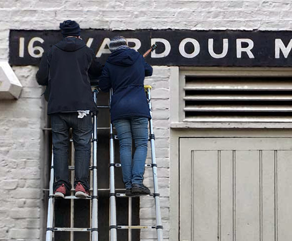
ORDER NOW MADE EASY
PART 2: FONTS OF DISTINCTION
Trad Twist mix of Soho Retro SignS.
Our ability to make the ‘Old World Delights’ come to Life! Shown on this page and across the site using our Bespoke collections of London Vintage Roman, Soho and Docklands typefaces.
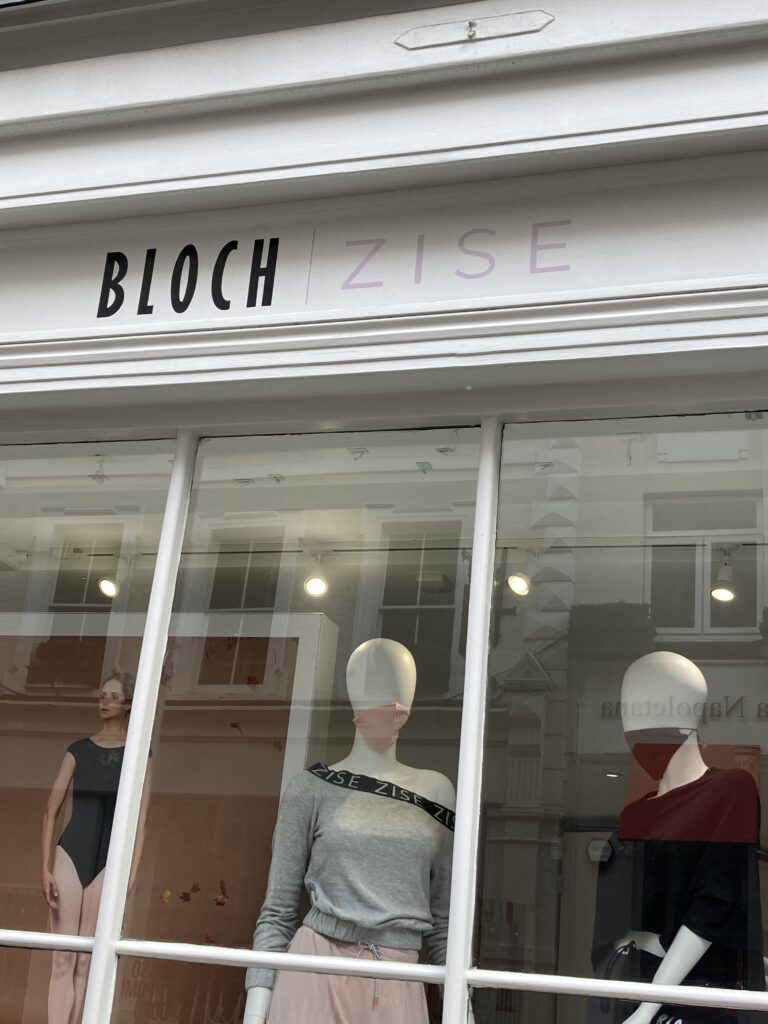
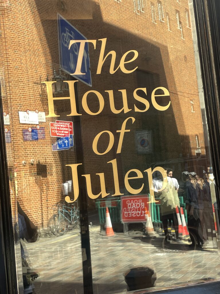
Today’s Branding Brushers
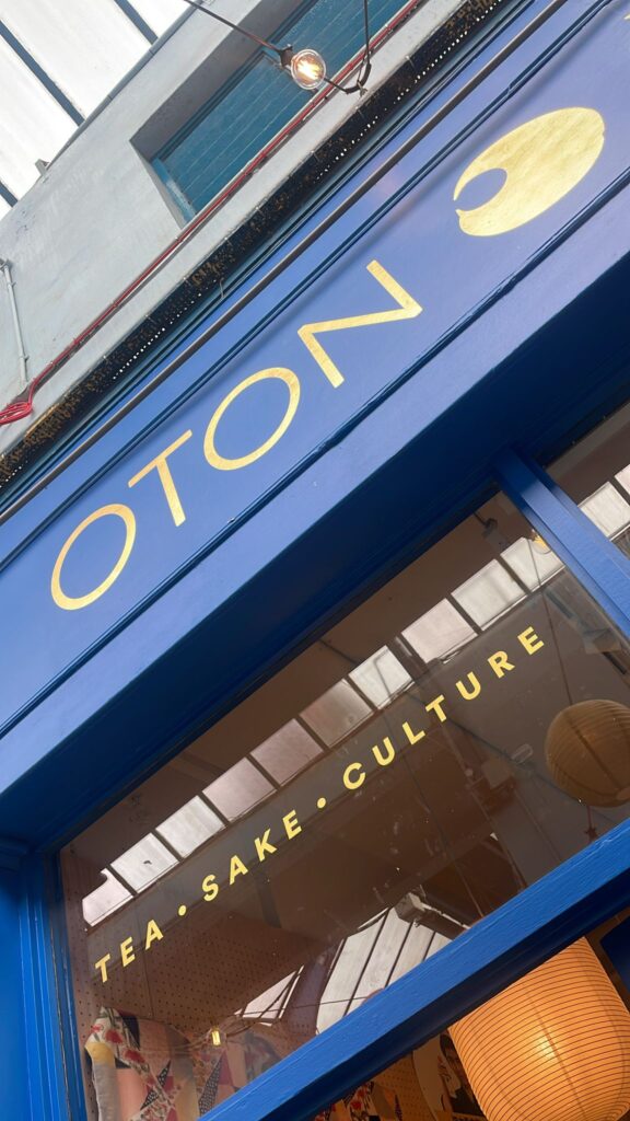
Above: Covent Garden cool type treats
Seraina makes the widest range of Pure By-Hand Brand Sign Designs
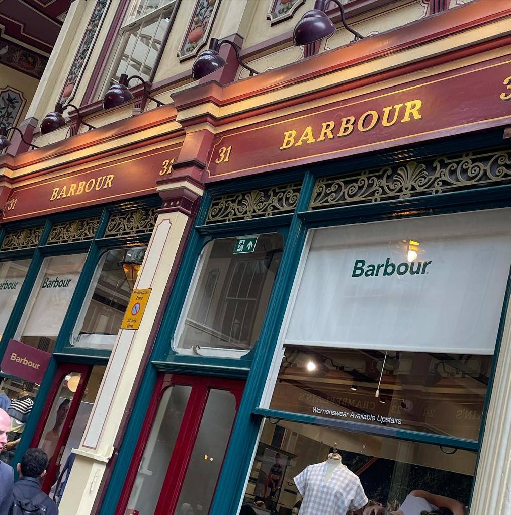
A true twist mix of lettering is what we do. Yes we can create classics for Barbour or Penhaligons, switch to Urban rustics for Le Labo and whatever else you can dream up.
We’re equally happy assisting and faithfully replicating your own design material or you need us to help create your brand ID.
The results are always strikingly beautiful, prompt and above the quality lines.
PART 3: CREATING NEW GENRES
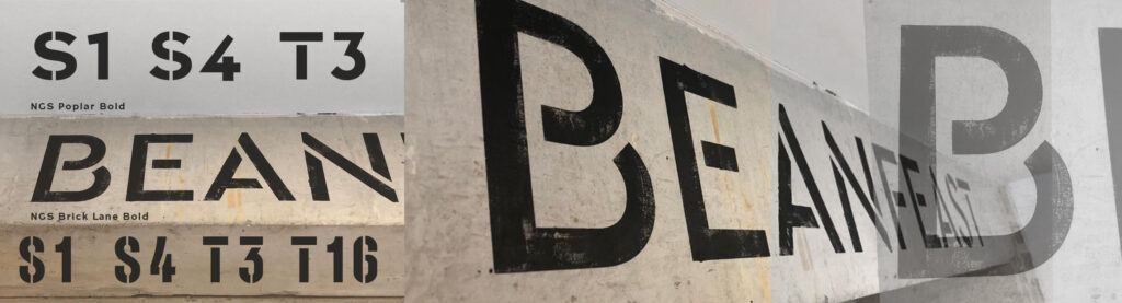
Murano’s Docklands Stencilled Roman.
Engineering type ingenuity.
A new Legendary London deserving of
“Fashions fade, style is eternal.”
Yves Saint Laurent
WELL SAID STYLE OUTSHINES ALL FAD:
It’s easy to taste the allure of new splashes of fashionista design trends… they instantly appeal, sugar coated, transient, beautiful, and are just plain yummy eye candy, nay addictive!
We all still love genuine, crafted, High Street design.
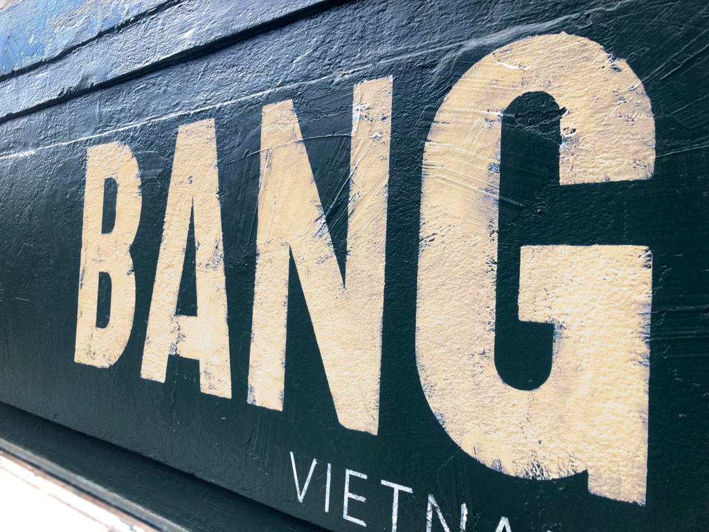
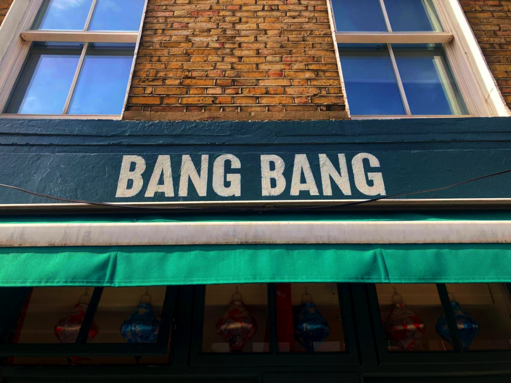
Finding our clients a meaningful lasting future and High Street footfall edge
Today, almost instantly, uber sweetened Ai design styles become meteoric bangers.
With Insta and Tic Tok coverage everything is ‘out of the bag’ and so ‘last years’ spam.
With our proper design confidence and experience you’ll load a design that has lasting appeal and beauty… banging but banger free.
BARBOUR LEADENHALL MARKET

Need some ideas on pricing and availability?
NGSeraina@gmail.com
LEADENHALL MARKET STYLES: INSIDE OUR DESIGN PROCESS:
As a dedicated signwriter and graphic typographer I found myself drawn back to now working not so much from the screen based type faces, but to the raw facades of London. Mixing paints in the winter cold and summer smog, alongside the new Shoreditch street artists, amid a capital breathing revival and a new creative agenda toward ‘by-hand’ and new era digital creativity alike.
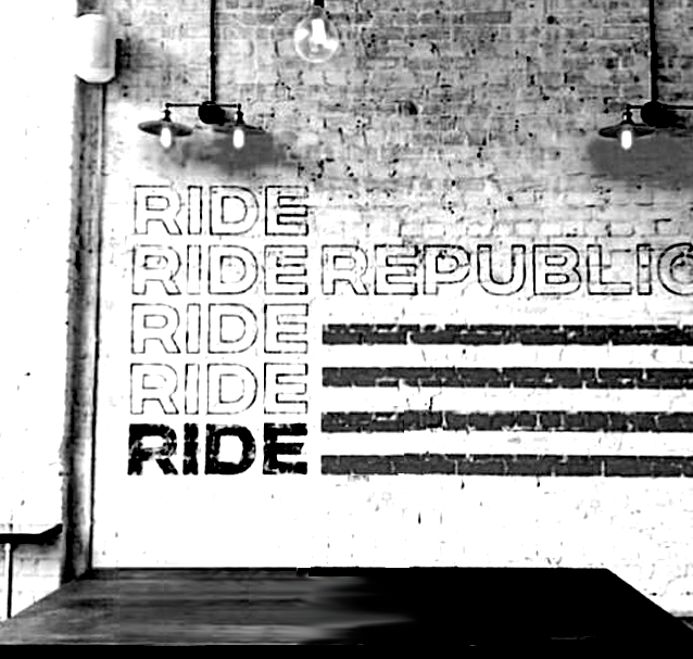
“Fashion you can buy, but style you possess. The key to style is learning who you are, which takes years. ” — Iris Apfel.
Graphic design fell into categories of sharp fashion, right through the growing ranges into the historical archival alphabets, which were birthed in deep antiquity (200 BC), to mid century and the more recognisable modern day brand design era (1905 – London Underground – Frank Pick influence).
These timeless ‘influencers’ literally shaped mine and many fine lettering artists lives.
Today those ordinary lives and extraordinary shapes are presented here. Reflective, gracious, and time honoured… yet always convergent, dipped in freshness of London’s future trends and styles.
SERAINA SIGNS
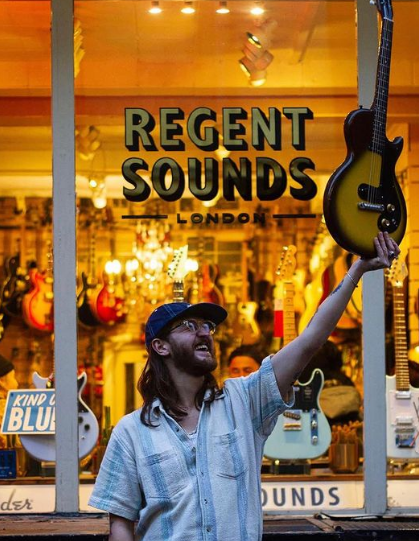
Let’s start your next sign project!
NGSeraina@gmail.com
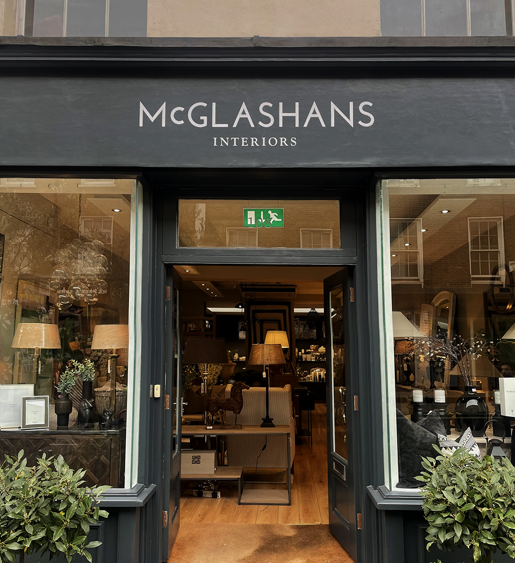
PART 4: CLASSIC LONDON TYPE. Gill Sans Bold Condensed for Regent Sounds and Johnston RESTORED Type for McGlashan’s
For McGlashan’s we noted their desire for Baker St/Marylebone heritage and era mood. Our fine tuning included polishing kerning and introducing some micro characteristics found in the Baker St. station heritage Johnston signage.
We call Baker St our typographic ‘Johnston museum station’. It’s featured on our APP, adorned with original signage typography in situ in that fabulous station.
NGS Copperplate in Red & Gold
NGS Copperplate in Red & Gold