Being a part of NGS
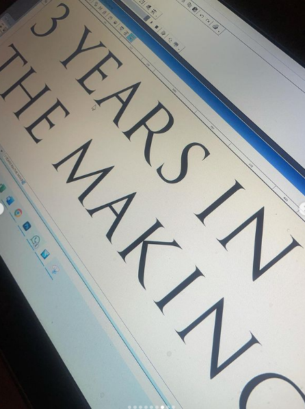
Our custom typographical work has become an absolute of everything Nick and I do as trend leading Lettering Artists at NGS. This Article maps the key-points of our NGS shared journey.
ORIGINS
THE END OF INK: BLUE COLLAR TO SWEATSHIRTS
Mid century graphic design process evolved from manual glue pot paste-ups and hand-drawn layouts to Photo Mechanical Transfers. From the mid-eighties onwards, typographic design embraced digital tools in earnest moving on again technologically and losing in the main the factory floor culture, the raw smell of ink, clatter of cast iron and steel, and the senses bereft of manual, blue collar contact.
DESK-TOP PUBLISHING IS BORN
”In 1991, I was studying graphic design at London College of Printing, my first encounter with CAD happened. Quark Xpress and Aldus Freehand design programs, allowed me to develop a clear-cut graphic/sign layout into a far more defined and coherent brand message. It was the age of floppy discs and 50 megabyte groundbreaking Apple Macintosh machines… but it was great to have a new responsive tool and probably framed my hallmark style as new and sharp-cut classics.
Adding to my unshakeable loyalty to the analogue brush, pencil and paper, digital design assisted certain hitherto out of reach projects beautifully, and still does”.
Nick Garrett

COMPLIMENTING THE ELEMENTS
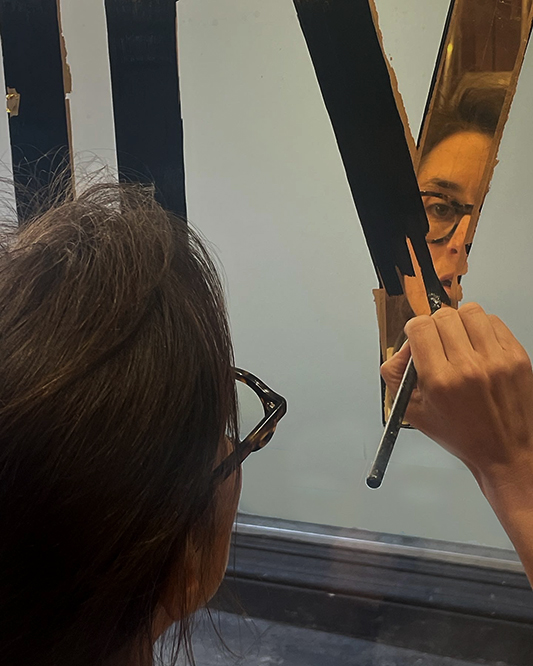
Introducing Seraina Baumgartner to the team meant us having a direct connection with our Swiss type heritage and use of advanced CAD tooling. Along with gaining new access to market trend activity, such as typeface design and sign restoration, the new mix brought us opportunity to shine out from any other sign writing company in UK.
WE LOST BOWIE WE GAINED CHANGES
”It’s important to go a little further just out of your depth to really discover something new”
David Bowie
Today we have today a studio that projects a talent and capability to design for corporates and retail legends. Our new-school approaches compliment our Heritage London reverse glass gilding reputation. We now include full font creation lab aiding our powerful graphic design work, sitting alongside everything we do that drips with paint.
The holy grail of custom font design is now a natural option for our new era of NGS typographic painted sign production – our daily bread, in-house, has become new product development.
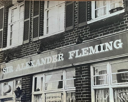
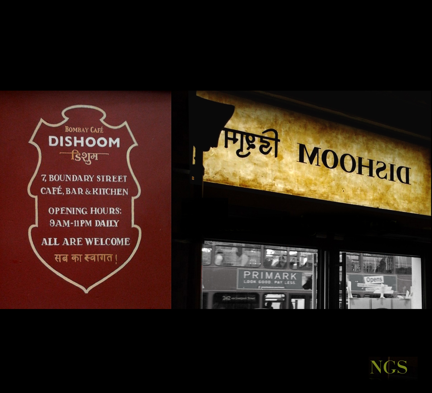
NGS Origins c1982 Watney pub sign writing.
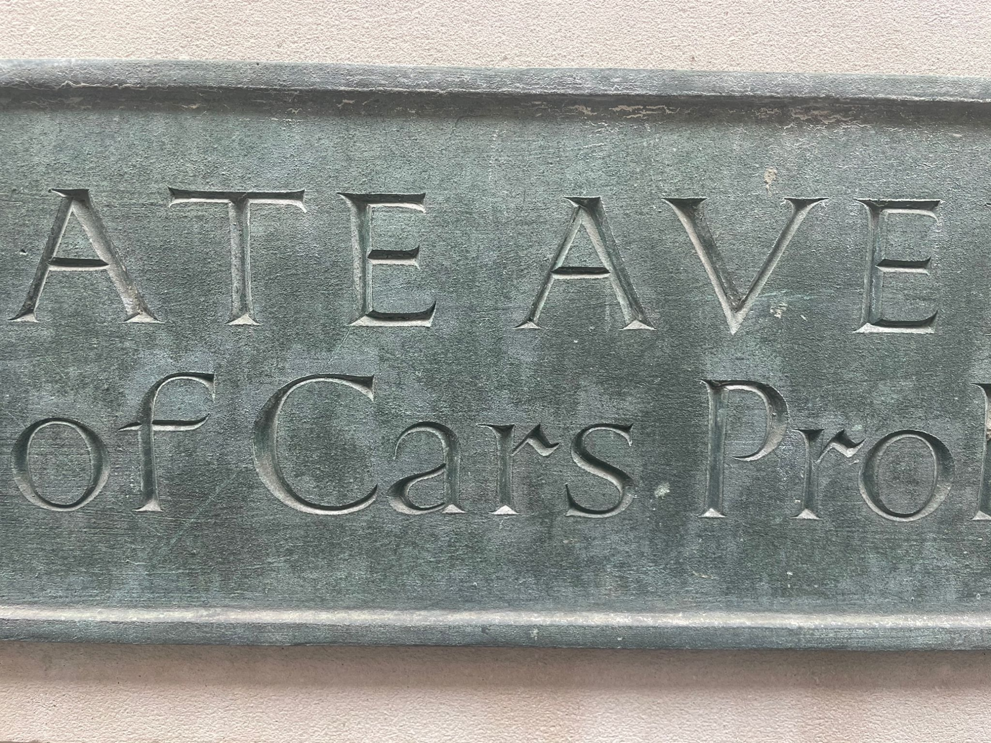
FINDING: THE NGS FOUNDRY LANDSCAPE
We may see a typeface on the way to a project that ignites a brand new font family, or the destination project itself often reveals the same. On arriving at BMA in Canary Wharf to update their Honours Boards, I stood in front of the 5m wide oak panels staring at rows of William Sharpington’s original works. 5m of one of the worlds great sign writers work fed me.
William Sharpington
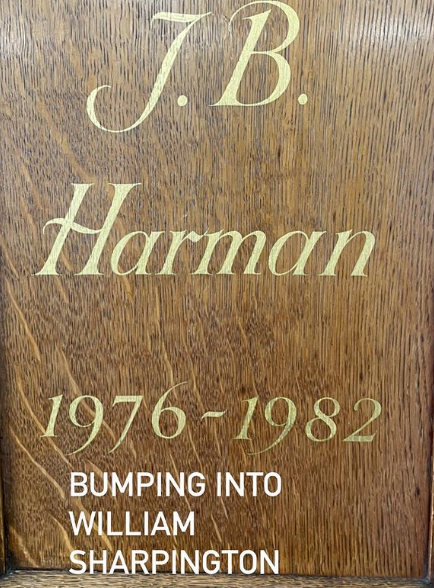
SOHO BOLD is born.

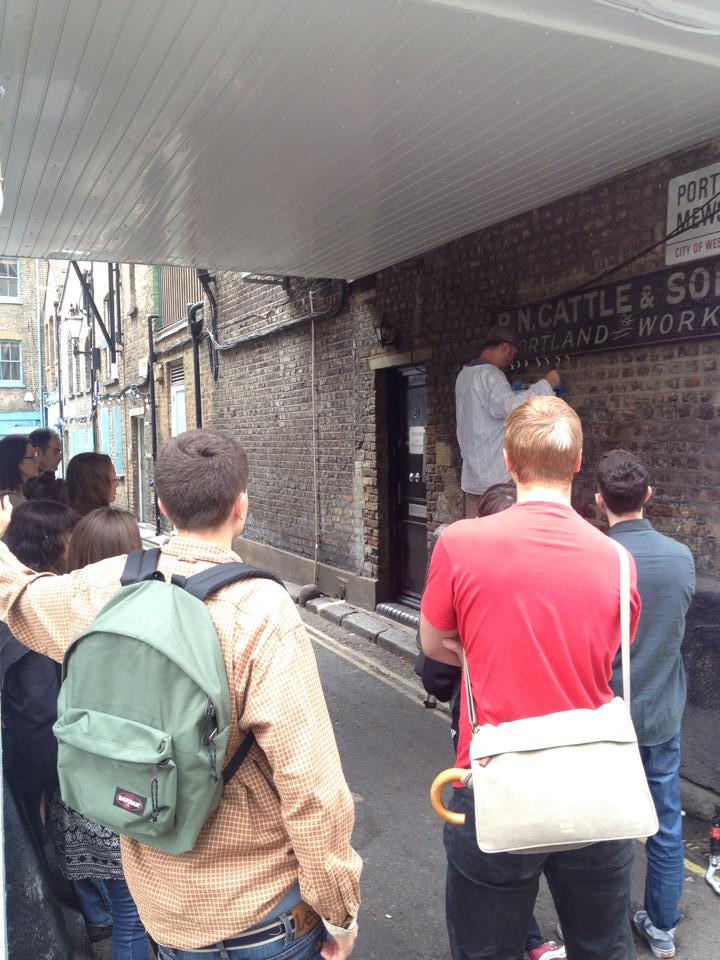
We constantly find, observe and discover, adding priceless refinements each day, as we venture through NGS installs. When we arrive home they get logged and downloaded into our archive. Long days… great days.
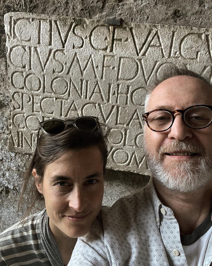
It is the perfect setting which now hooks up with our own family jaunts to and from Zurich, Pompeii and Emilia Romagna Italy – and of course both extremely important historical typographic homes.


What started as a collection out of a love of Helvetica, Clarendon and (Edward) Johnston, has quickly embraced the likes of Giambattista Bodoni, Haas and Muller Brockmann.

It’s a game-changing practice and unmatched standard we proudly call our own.
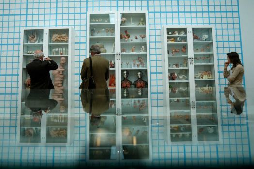
Damien Hirst Tate Modern Retrospective 2012
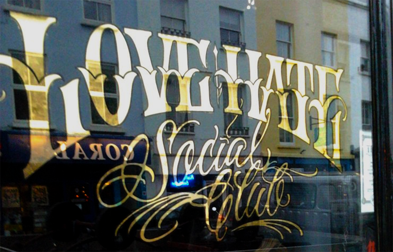
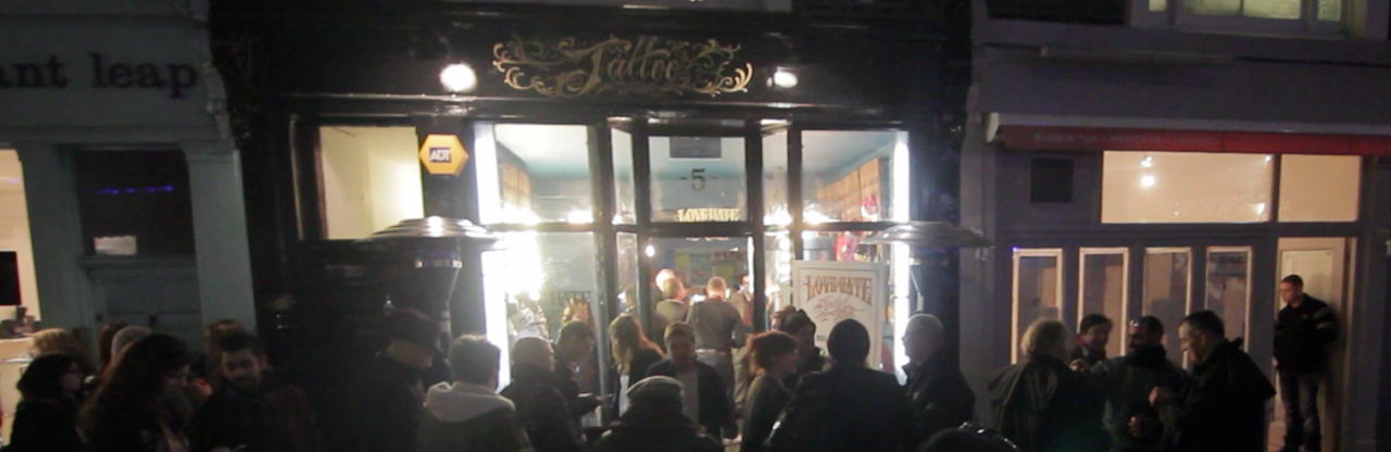
Love Hate Social Club London 2013
One of those fellas is Banksy…
AstraZeneca, Cambridge 2023
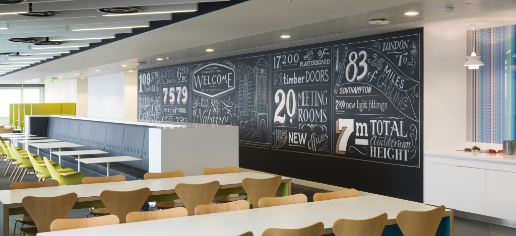
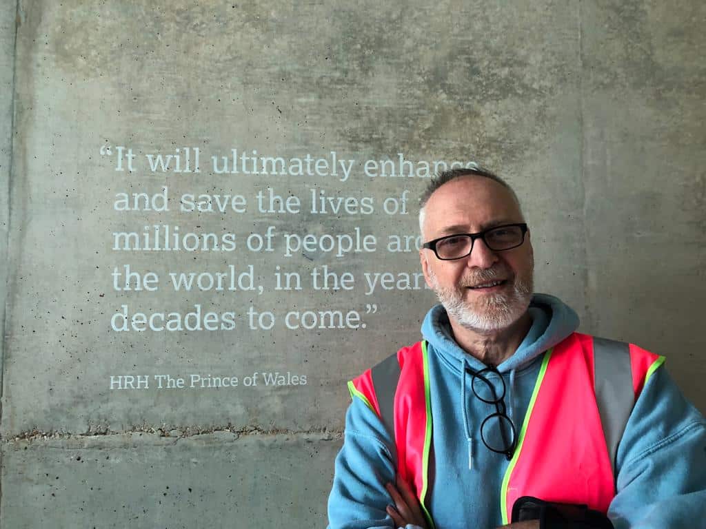
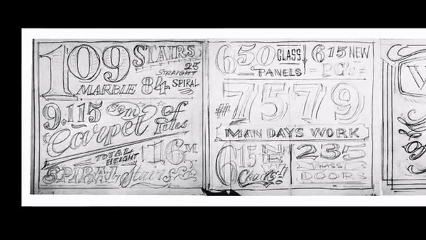
Nabarro London Wall
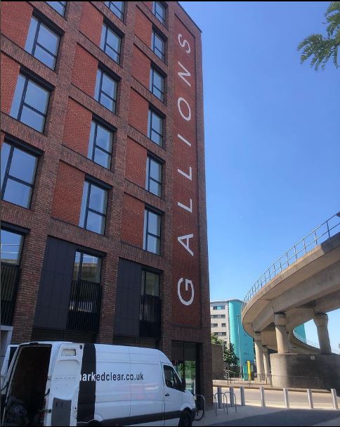
Gallions Reach
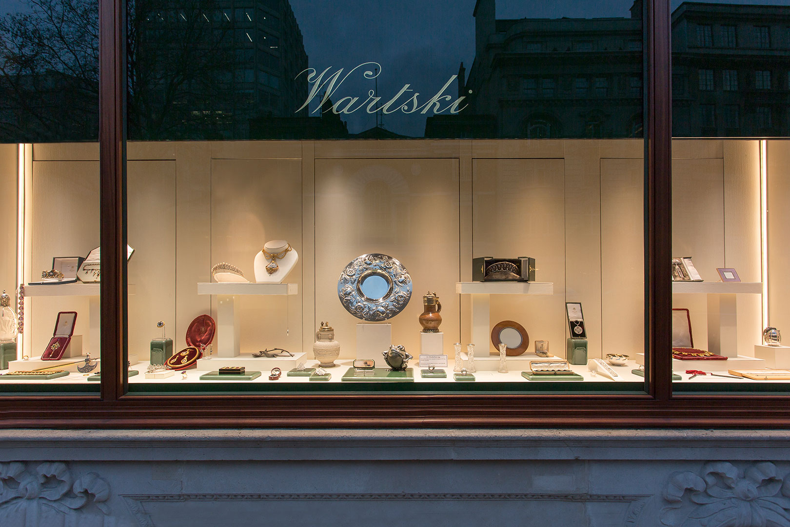
Watski of St. James’s.

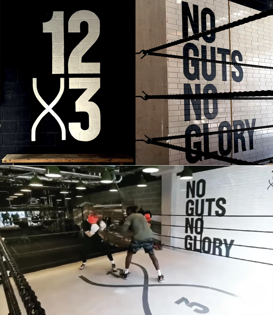
12X3 Boxing Gym
#footnote#handmadeletters
NGS Fonts
Origins of Type and Tags
As with modern social media, Pompeian graffiti of c75AD, were also subject to phases and trends.
Gladiators and ships belonged to the favourite motifs for sketches, and writing names in the shape of a ship soon caught on as well.
The same lines from popular literature were written on the walls over and over again, and greetings mostly repeat the same, fixed phrase that we also find in Roman letters.
When a certain Aemilius began to write his name backwards, two other men, Curvius and Sabinus, took up the practice as well, until all three of them were messaging each other in this manner on the walls of one particular house.
The word “Menedemerumenos”, whose meaning we do not know, also came into fashion at some point and spread all over town, perhaps as a kind of riddle or game.