DELIVERING THE FINEST. TO THE FINEST
IN THE WORLD.
Roman Lettering Specialists
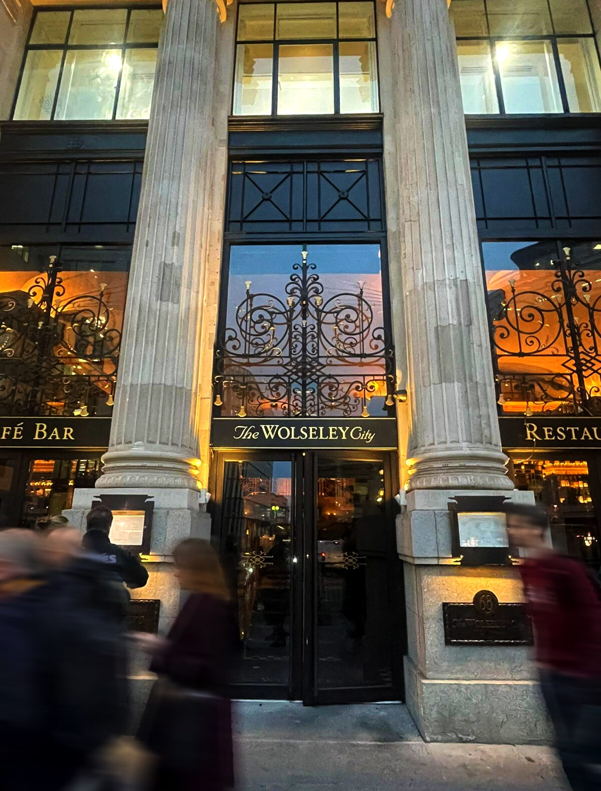
The Wolseley City
Introduction
The Wolseley City Restaurant signage project came to us via our website ‘Roman’ page link and immediately had my full attention, as Chris Wood, head of Wolseley City graphic design unfolded the story.
The Wolseley City was already established as a luxury restaurant and bar venue in the heart and Gateway to the City, when we first encountered the project.
Opening their doors in 2023 – in the twentieth anniversary year of its iconic Wolseley Mayfair, sister restaurant – The Wolseley City brought a sense of familiarity and timeless elegance to the London Square Mile.
Today it’s reputation precedes itself, offering guests a fine dining experience, inspired by its European culinery heritage, rich in hospitality and refined neo-classical interiors.
Setting a note of style
The Wolseley Hospitality Group acquired the site in July 2003 and its restoration and renovation was overseen by David Collins Architects. The Wolseley opened in November 2003
The City of London: Incredible location and hand painting a legendary setting
ike the original Wolseley Mayfair, the City site is located in an iconic flagship 1920s building. Situated on King William Street close to Monument Square, on the busiest 5 ways intersection in London’s Square Mile, home to the world’s financial district.
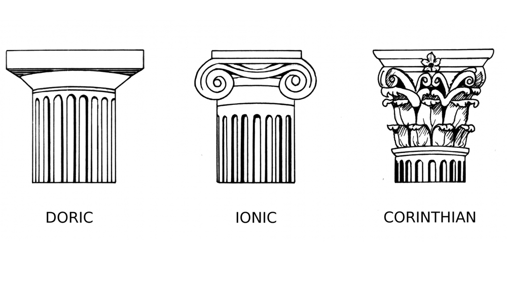
Formerly a bank and later a department store, this striking building is known for its stunning Ionic ornate, columned facade.
Creating our Sample gilding
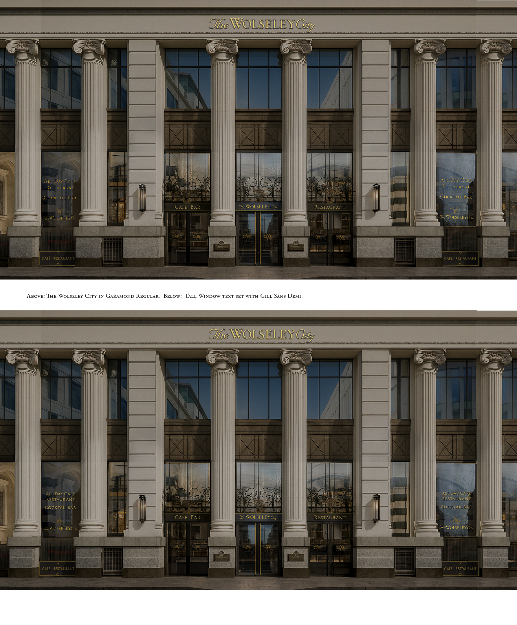
Design test sheets and gilds were created, trialing placement ideas, lighting and reflective context challenges with full colour mocks and visuals.
Our designs aimed at raising the bar on all other local food supply chains and bettering any brand design or sign studio, for design detailing and delivery quality. There’s nothing quite like it in London or Europe that’s for sure.
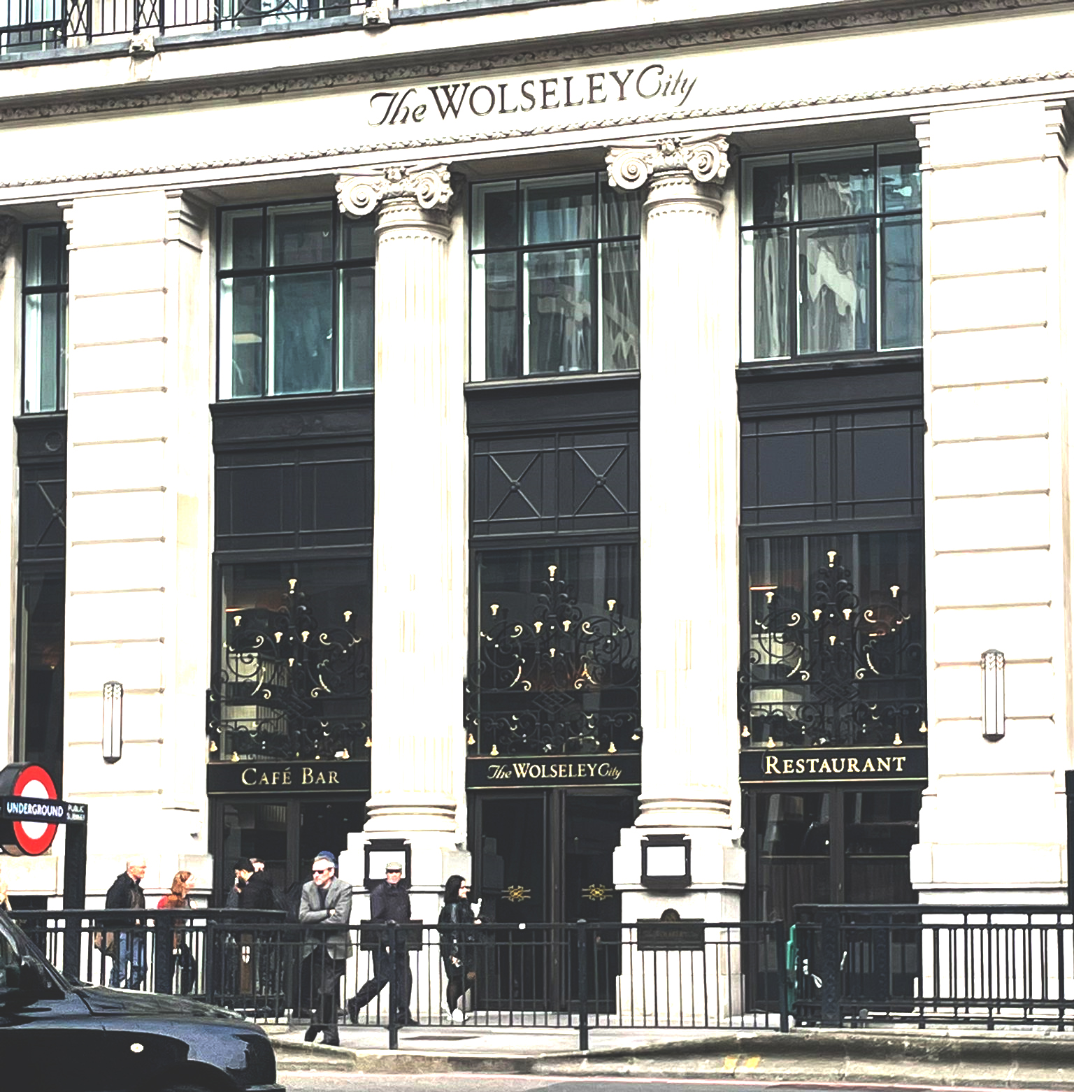
Wolseley City Restaurant Signage:
Typeface choice
‘NGS Garamond Demi’ custom font creation
It just felt like the most suitable brand typeface: Garamond, and was selected by Wolseley’s in-house design team Louise and Chris, at the helm of the look and feel of this huge exterior showcase.
The original Garamond Pro font was taken into illustrator and refined where needed – the majority of serifs in the pro version appeared faily ‘slow’ around the visual pathways and I was allowed to smooth out transitions, reset kerning and clean up letter foms, weight and fine counter space detailing.
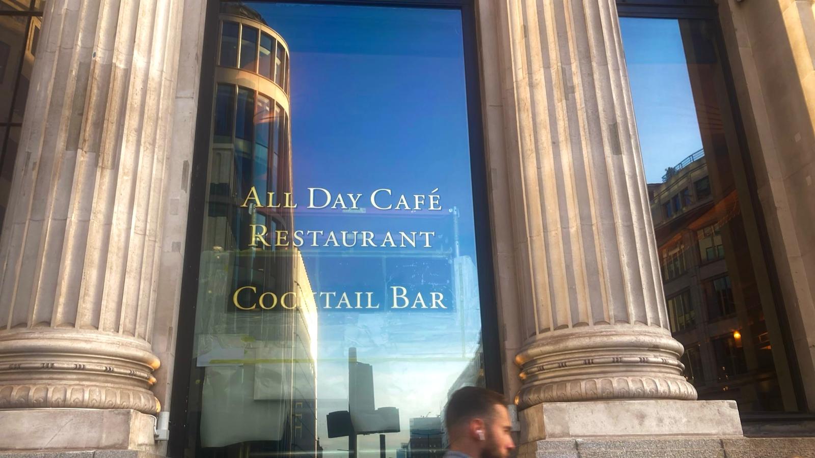
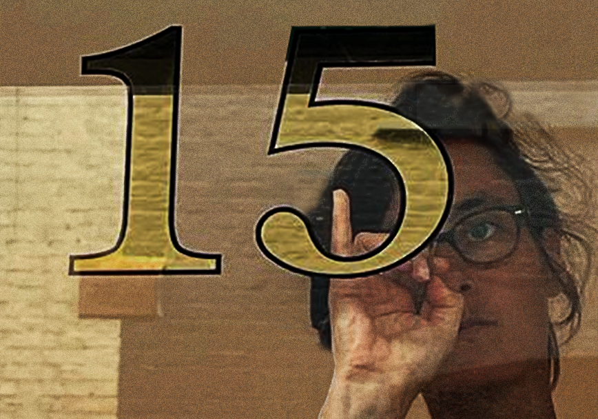
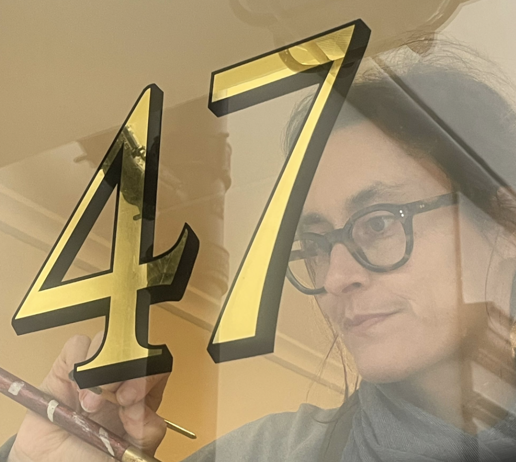
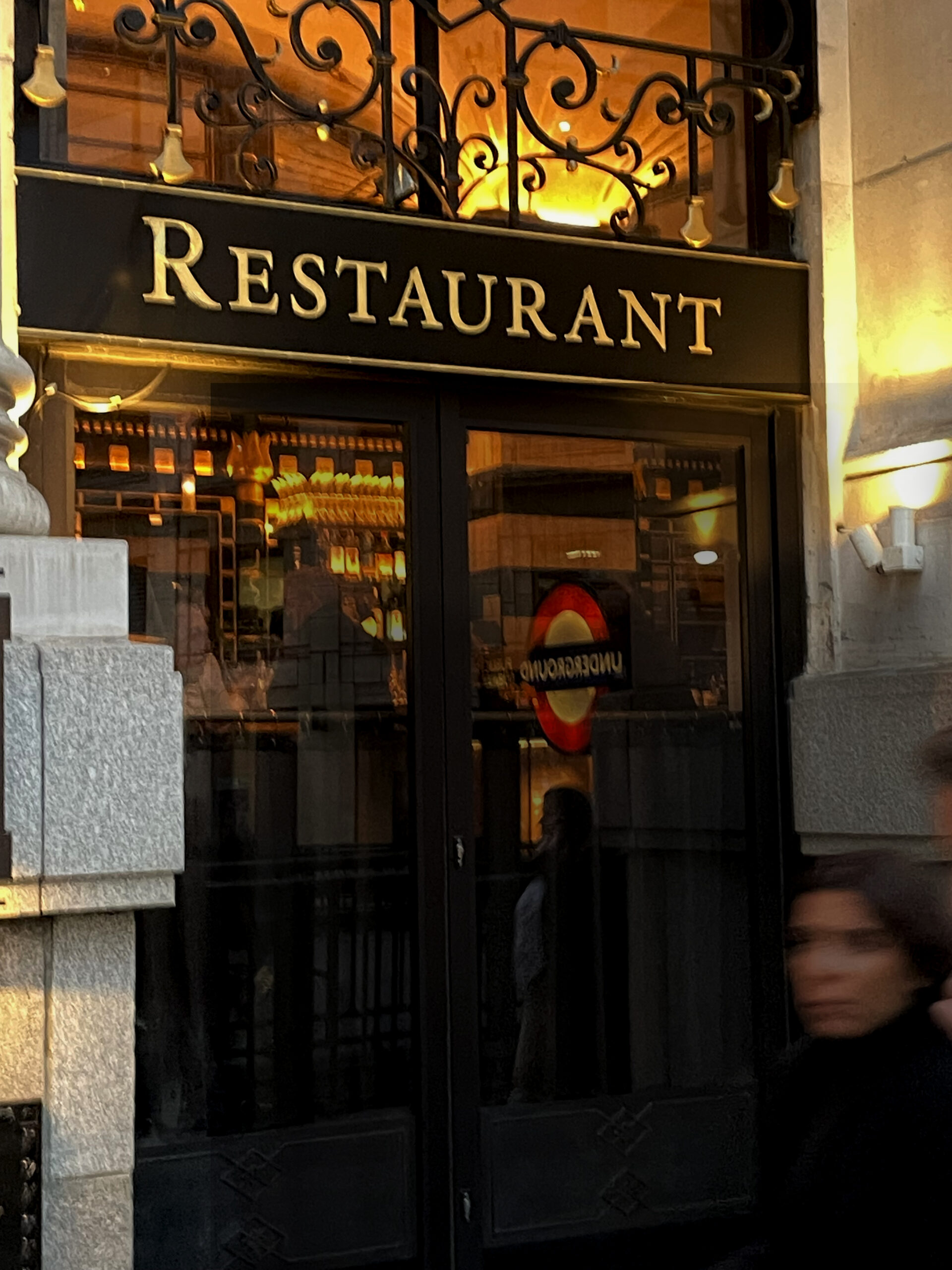
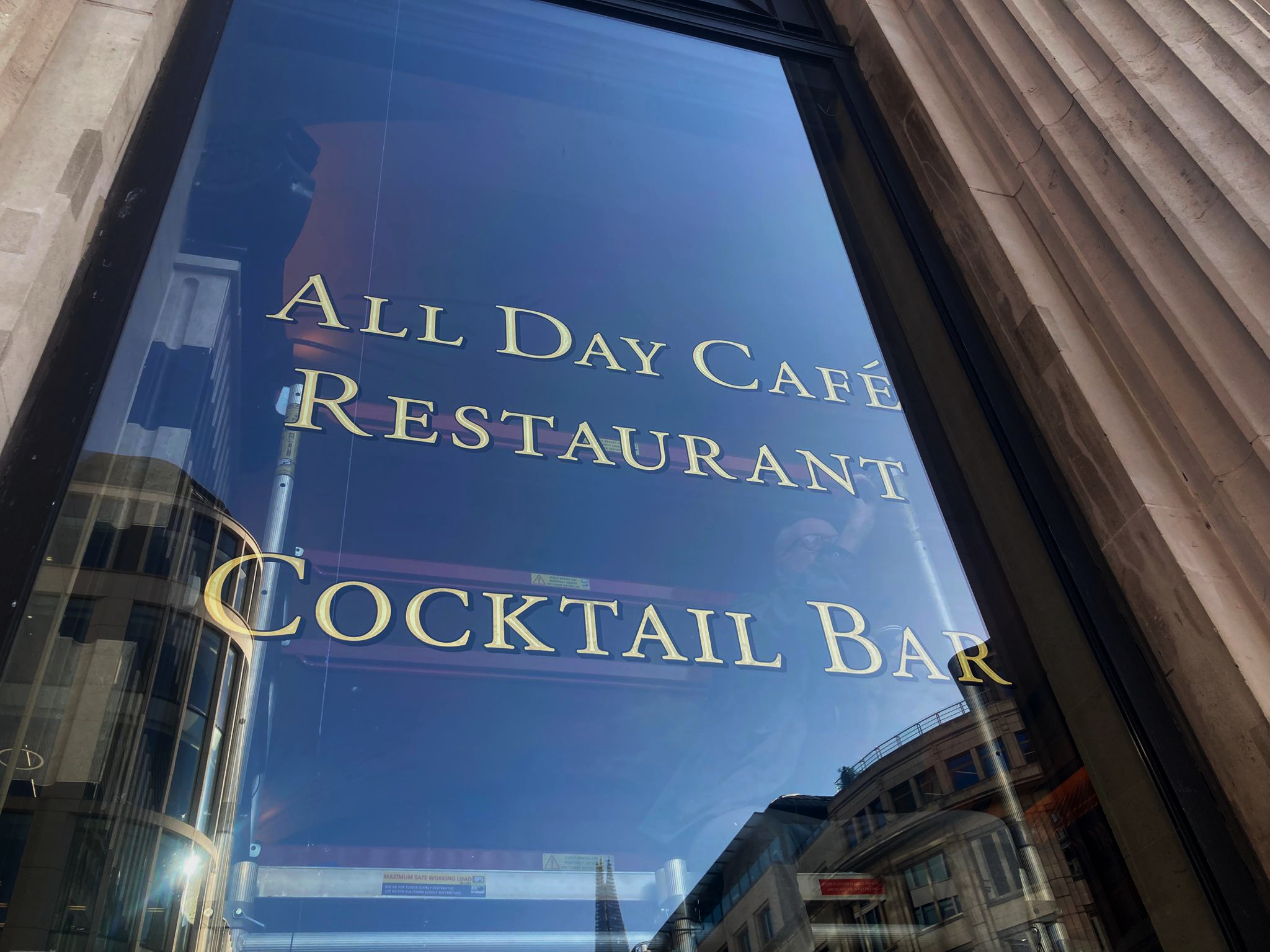
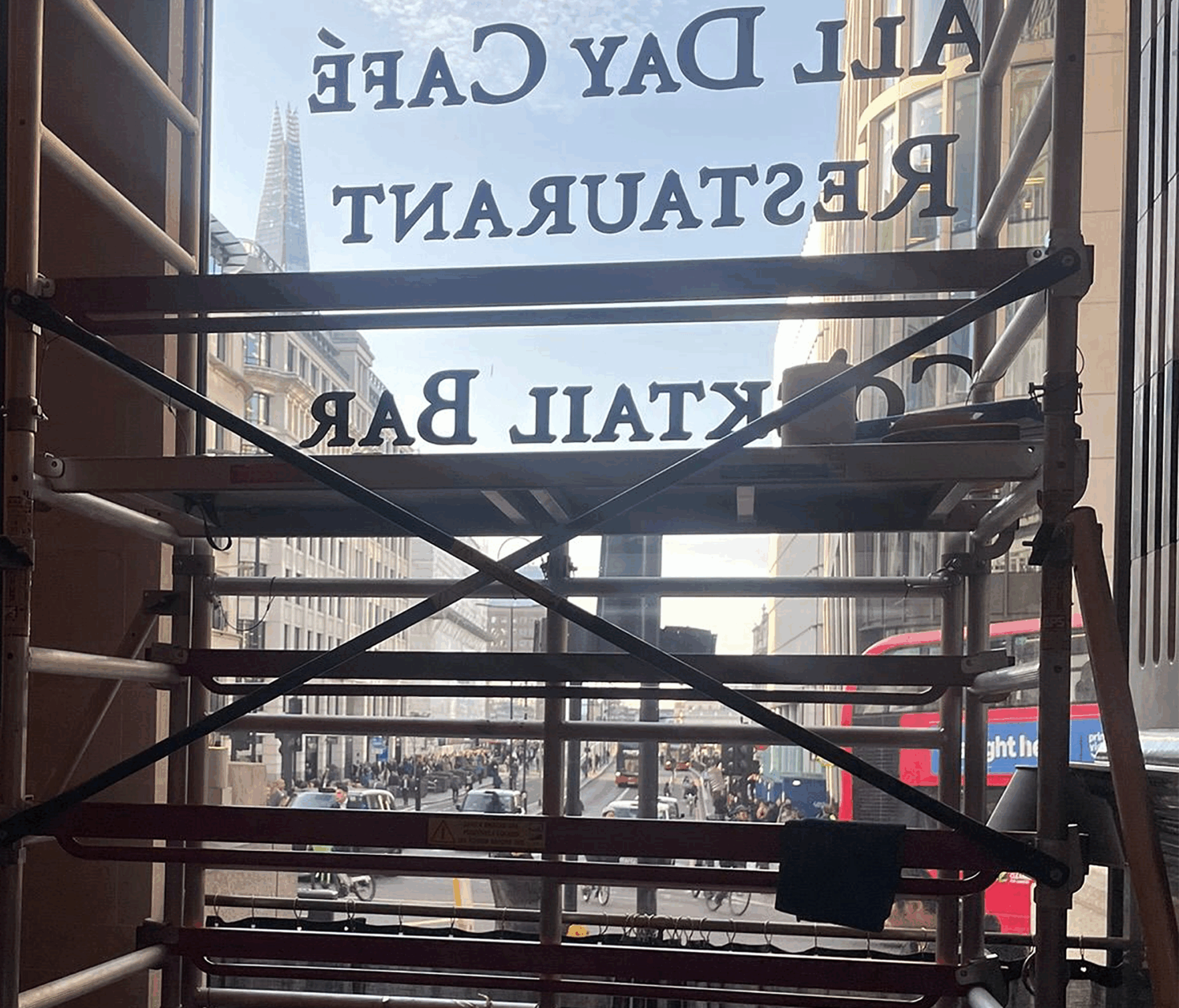
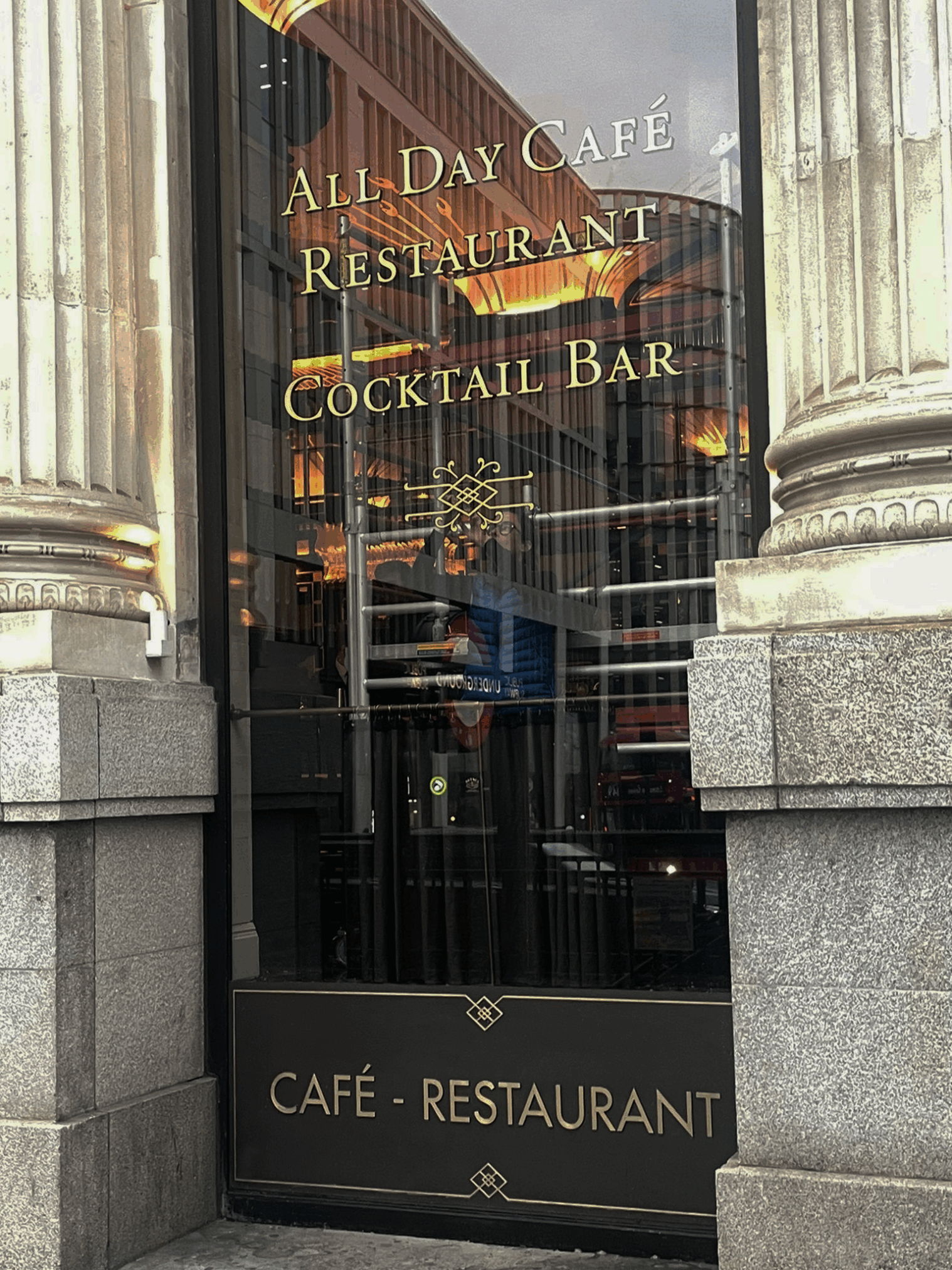
Above: The main window Gilding work in progress – an outline and offset ‘drop shade’ was engineered into the final lettering for greater visibility over our target 30-40m viewing-catchment distance.
Presenting Wolseley City designs via full colour brand visuals
We created these stunning sets of full colour visuals along the way, in order to assist decision making by the Wolseley team. These two sets show versions in NGS Garamond Demi and NGS Gill Sans Originals typefaces.
Wolseley City Restaurant Signage: On site at the Wolseley City
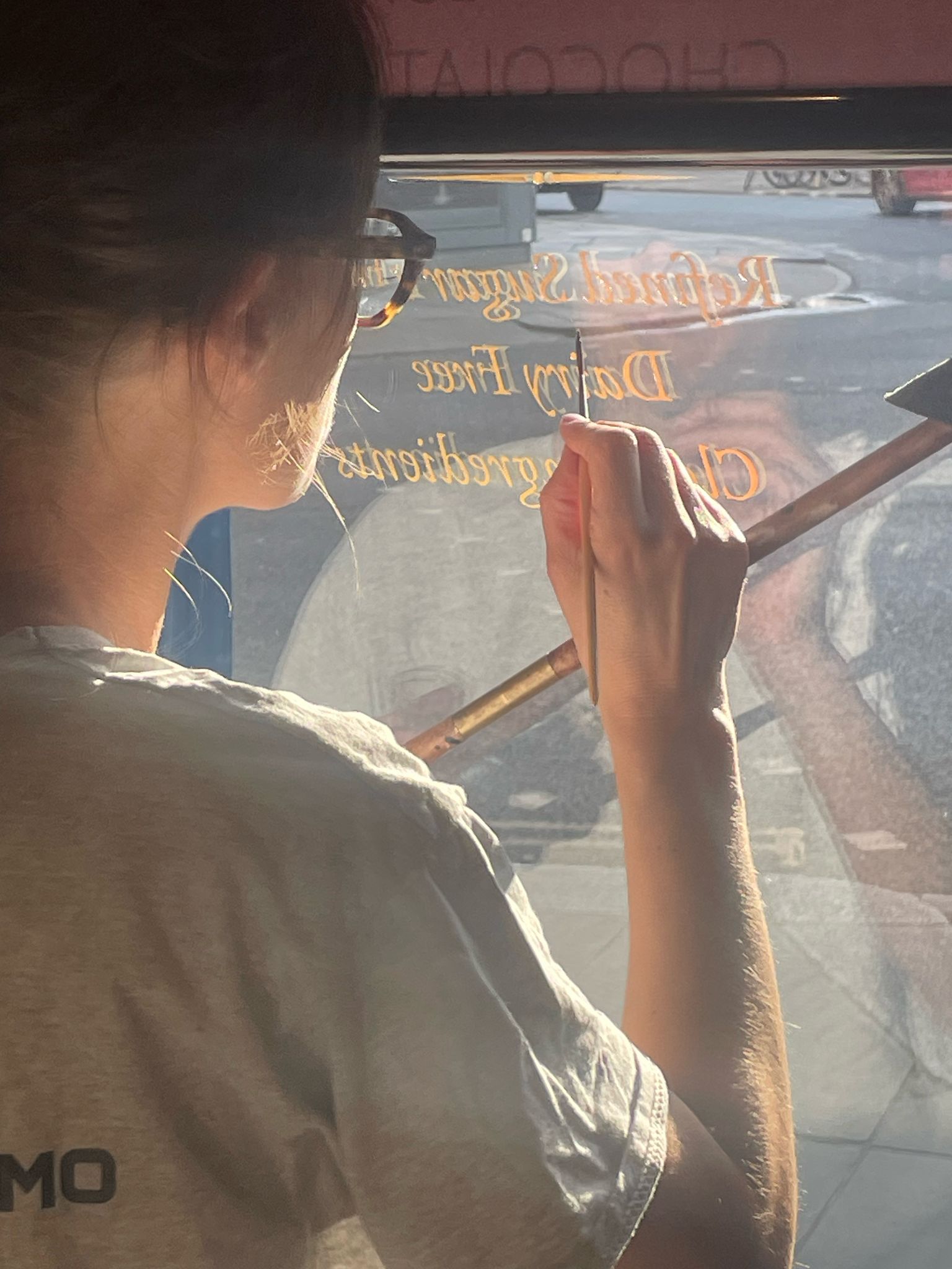
TM 4 days – proudly all done.
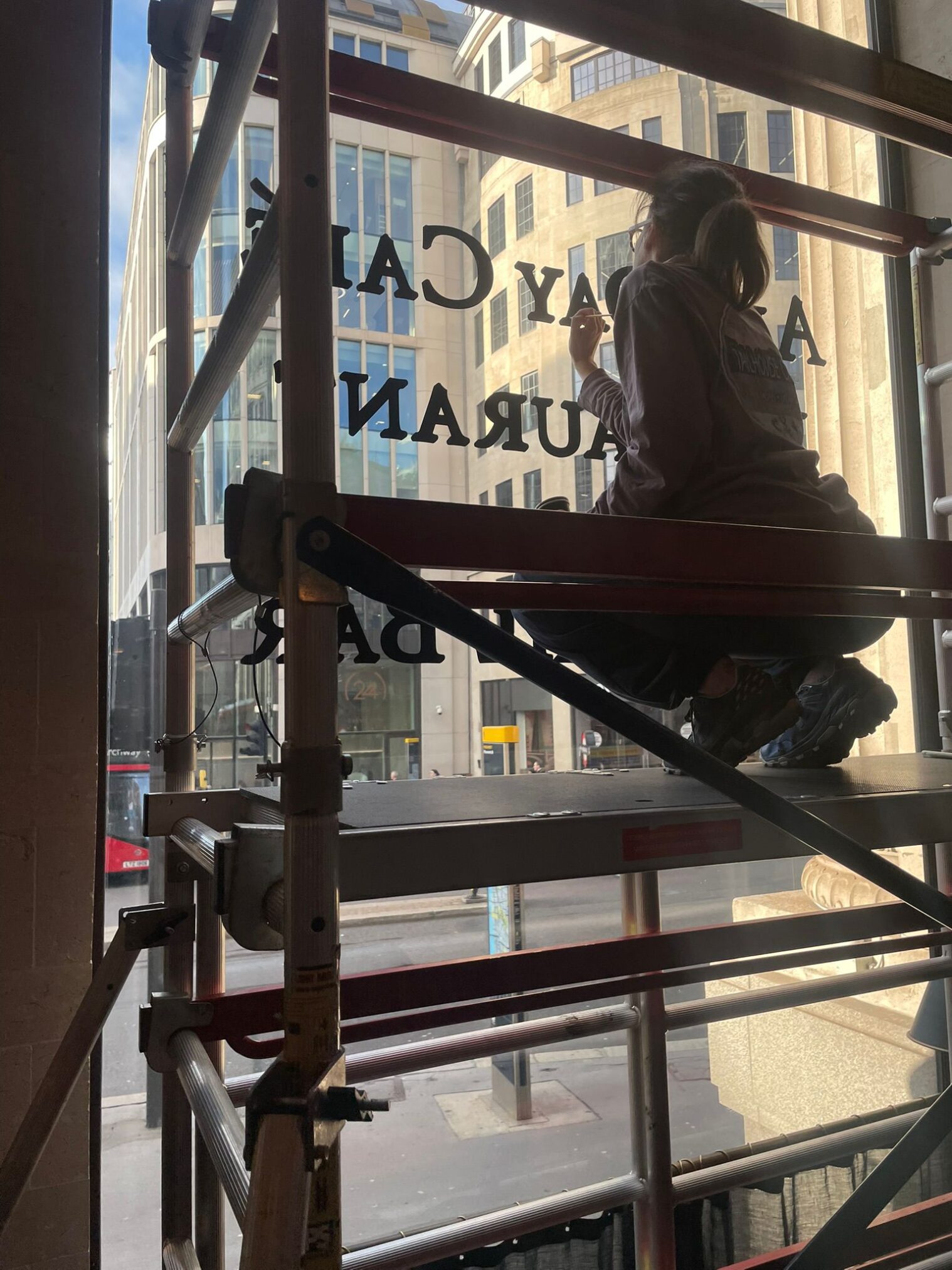
On site at the Wolseley City – Seraina Baumgartner (the ‘S’ in NGS) gilding and the view across London Bridge toward the Shard. During morning peak times, a surge of roughly 6,000 people an hour enter the city by this bridge by foot or cycle, making the Wolseley the first major breakfast destination they encounter.
Purest inlined Gold leaf, for lighting and maximum stand-out
A critical box that needed ticking required visibility of the new signage from at least 30m. Gold leaf on a dark ground gives out the greatest luminosity – more so than any other painted surface.
The 24 carat gold leaf and lemon gold inlined lettering is now visible from a distance of 100m, from the mid-point of London Bridge approach facing the City facade (above).
Factors influencing perceived brightness
- Purity (carat): The percentage of pure gold in the leaf determines its color.
- Higher karat gold (e.g., 23kt or 24kt) contains more pure gold, resulting in a brighter, richer, warmer yellow color.
- Lower karat gold is an alloy with other metals like silver or copper, which changes the tone and can make it cooler or less brilliant.
The final piece exceeded everyone’s expectations. A huge thanks to Mariusz, restaurant manager Dan, Davide, Micheal, Hamil, Mo and all the fantastic staff of the Wolseley City… including the chefs!
”Nobody can quite believe how much of an improvement this has made.
Chris Wood – Head of Graphics.
Call Seraina today for your tip-top tier or just plain special project evaluation and quote.
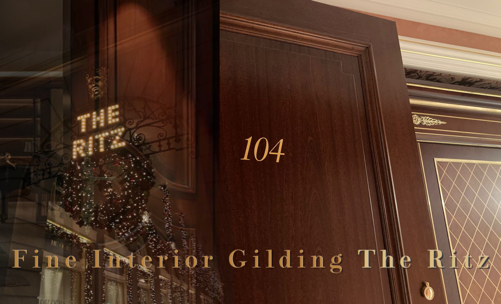
The Wolseley City Restaurant Signage