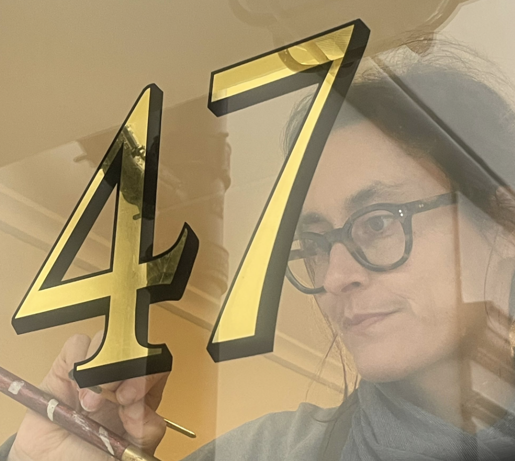
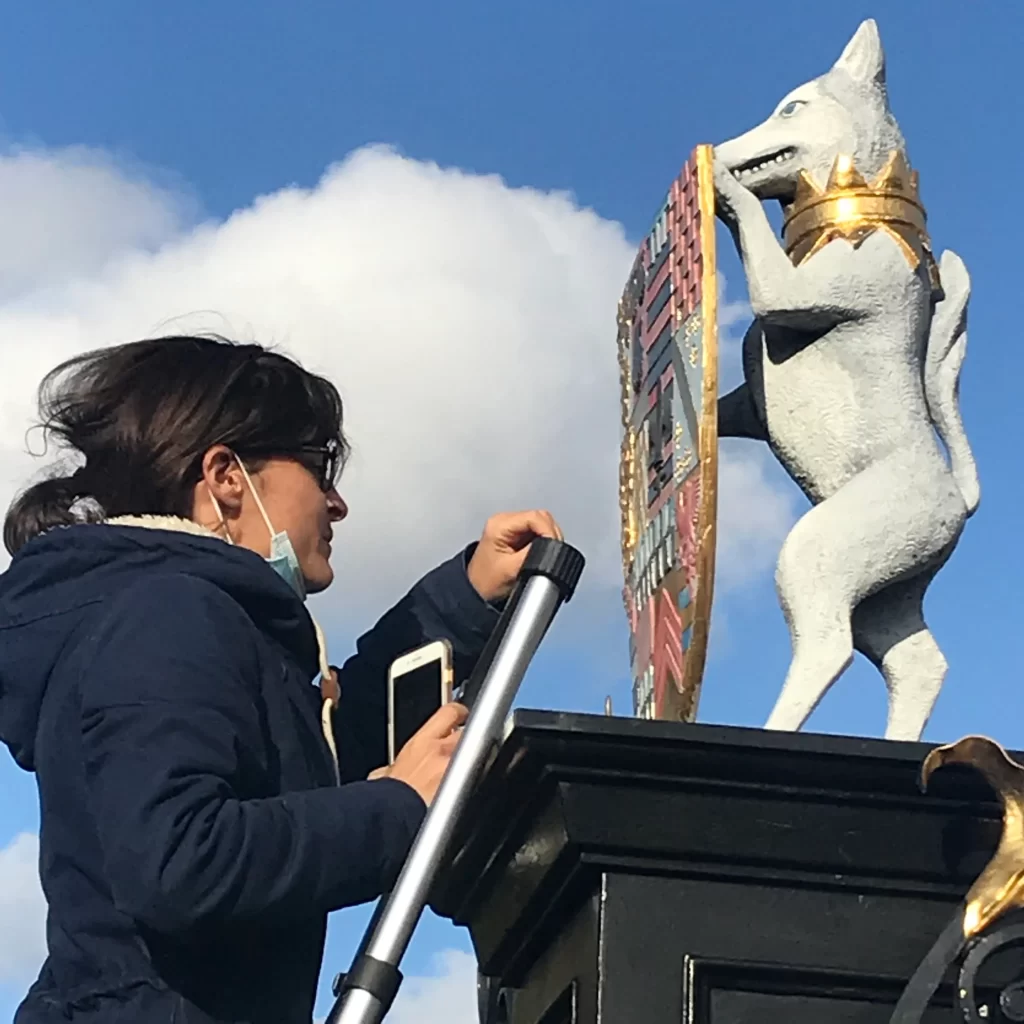
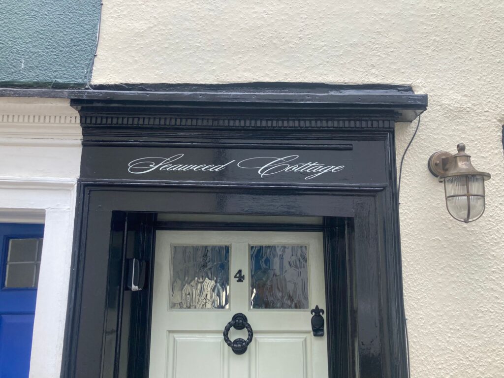
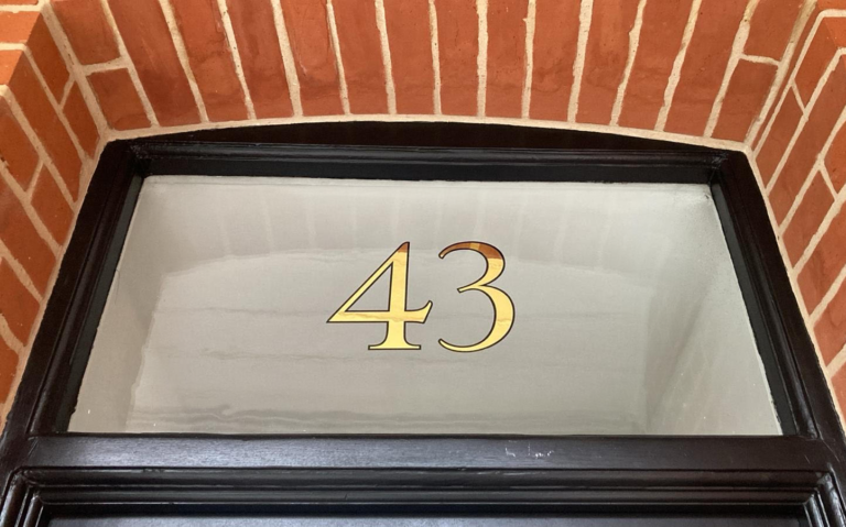
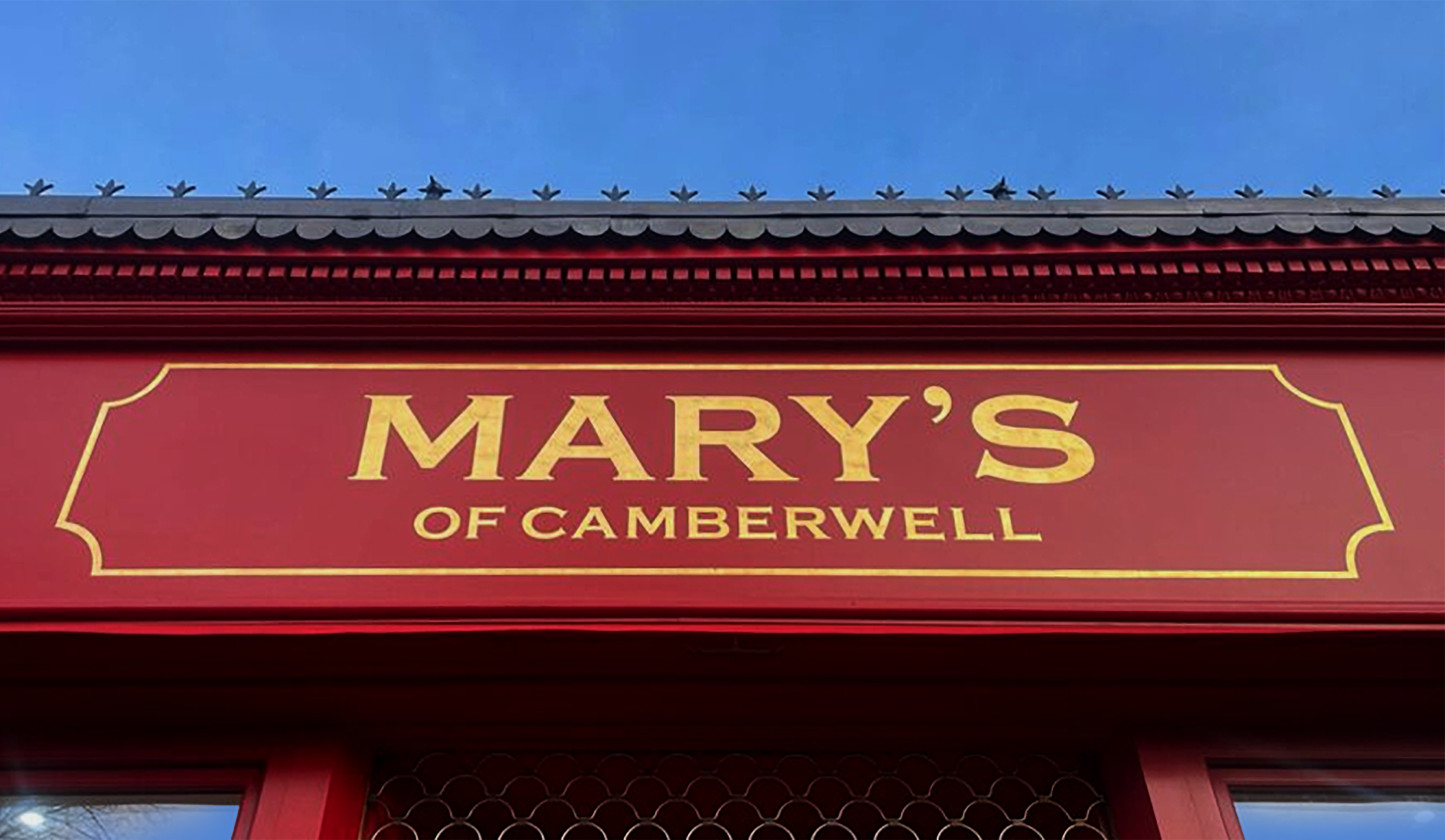
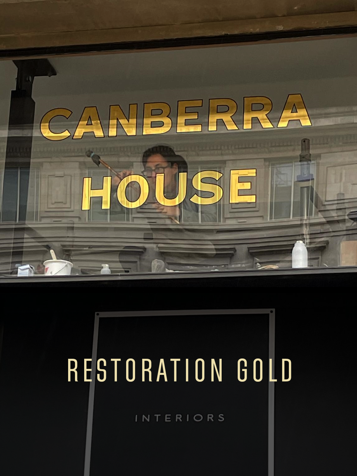
SHOP & CAFE LIFE!

Seraina Sign writers near us,  Richmond, west end London, Central London, Gold shop sign letters. Electric coffee co signwriter Seraina
Cato Covent Garden bar sign writer Seraina, signs London, Deal, Whitstable, Margate, Zurich
Windsor sign writer Seraina Signs
Front Room Cafe Signwriting by Seraina signs London
Traditional Sign writer, London UK Seraina, Brora front
Brixton Village signs OTON
Traditional sign writers London, Signwriters painters, City of London

For start-ups and established traders Seraina can help you get the most out of your sign ID.
A talented designer and skilled craftswoman, you’ll love what can be done for your budget.
London ngs signs

Order today.

Traditional sign writers  London, Signwriters painters, City of London

Traditional sign writers London, Signwriters painters, City of London
London Sign Writer, Seraina Baumgartner, contemporary Swiss graphic designer, letterform artist known for her refined use of classical Roman lettering traditions within modern design contexts. Her work frequently draws on historical serif typefaces such as Caslon, Baskerville, and Trajan, using their proportions and structural logic as a foundation rather than treating them as decorative pastiche. Baumgartner’s approach reflects a kinship understanding of inscriptional Roman capitals and early print book typography. Typefaces like Caslon and Baskerville populate her work through their balance of calligraphic stroke contrast and elegant forms, while Trajan’s influence is evident in her use of monumental capitals, classical spacing, and stone-carved strength. Her design agility references her work with a sense of classicism, authority, and legibility. The core qualities closely associated with Roman letterforms and her Italian/Swiss origins. What distinguishes Baumgartner’s use of these styles is her restraint and controlled scaling. Rather than falling into the common trap of many young graphic designers of overt overdressed graphic historicism. Seraina retains their essential principles — proportion, rhythm, and spacing hierarchy — and applies them to contemporary commercial worlds of retail layouts, wayfinding, and private house titles and numerals. This aligns her own heritage and design practice with a humanist modernist tradition, embracing classical Roman typography via the lens of Swiss graphic design precision.