.
Seraina’s Design Studio Custom Typefaces & Fonts | Clients Love our Minimalist, Precision Signwriting.
A SIGNWRITING STUDIO BASED IN LONDON
A SIGNWRITING STUDIO FEATURING STUNNINGLY BEAUTIFUL LONDON TYPE
Our high streets are full of poorly designed signs that lack authentic quality.
A hand painted sign, in the hands of a special one, always looks remarkable. Whether you are after something minimal or a punchy design that really makes a statement, think how our sign master skills, combined with inspirational creativity in graphic sign communication could launch your business profile, gain new clientele and give you growth.
Our signs deliver – by design.
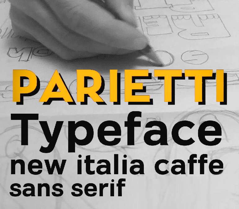
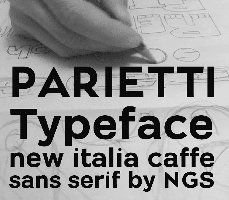
‘Parietti’ | My family namesake New Font | Bold Sans Serif | Seraina Sign Studios
A SIGN PARLANCE – PROPER LONDON
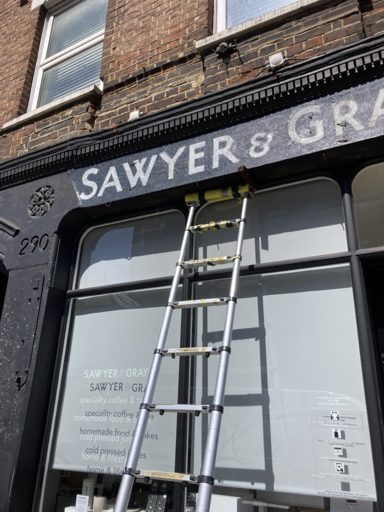
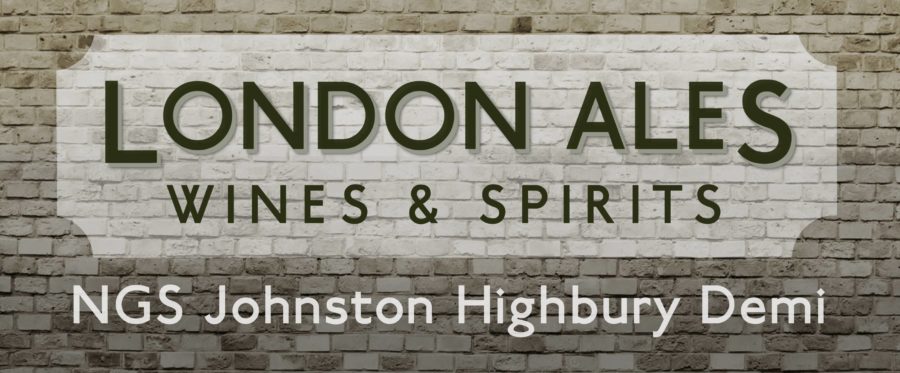
Restoring original Johnston Type at this great cafe in St. Paul’s Rd., Highbury.
.
How Sketch-ups lead to new ideas, new signs,
… and eventually our new custom, NGS published Fonts.
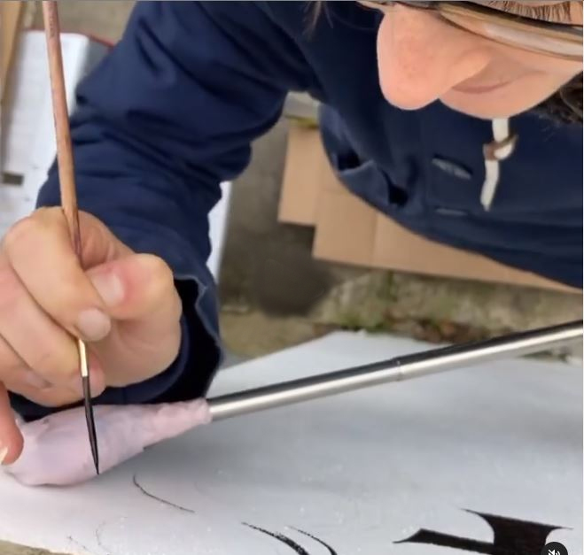
Custom sign Studio | Custom font painters ‘n makers
A lot of my custom typefaces and fonts come from my interest in groups of lettering styles, fuelled by hunger for ideas and inspiration.
They also come about from messing around on the drawing board, with a pencil and rubber.
.
The Inspirational Journey of Lettering and Font design
Most of my font designs arrive in-the-moment in the design studio, on site, or from working on project based design tweaks, as I did for Fred Perry.

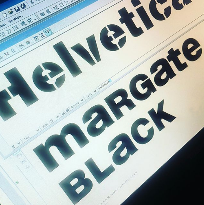
Le Labo | NGS Helvetica | NYC | Milano | Paris | London | Creativity from anywhere, takes you anywhere.
‘My new fonts come mainly from working through a long list of restoration type ideas, and client projects’.
Seraina: NGS Custom Typefaces & Fonts
.
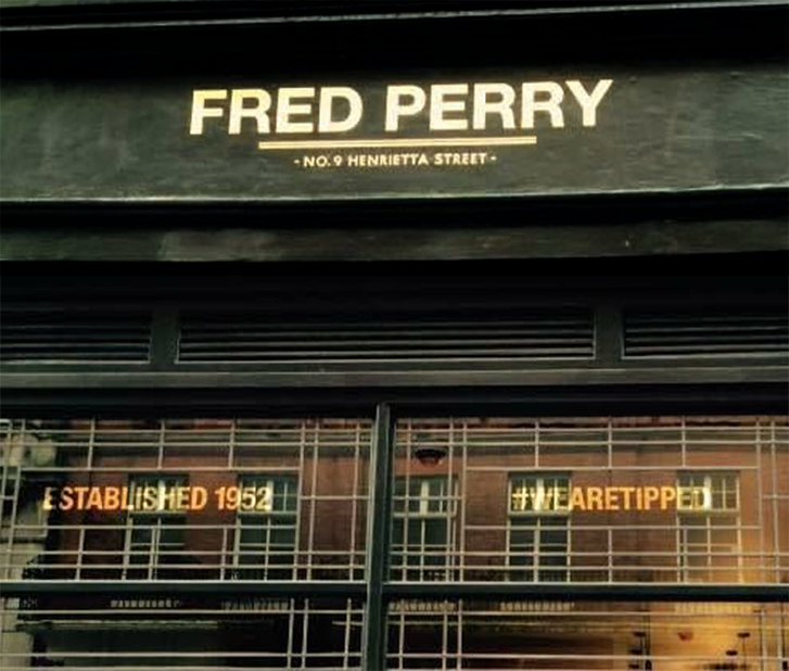
CASE: Creating the Fred Perry sign ID.
It was a privilege to have been asked to refine this incredible iconic ID for the Fred Perry flagship Covent Garden store – a really treasured project indeed.
We were asked to bring the façade alive with a distinctive London accent.
CHAMPIONING GREAT GRAPHIC DESIGN
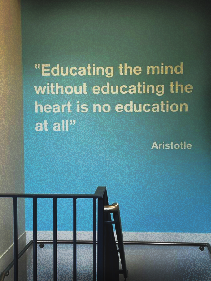
Above: We were asked to bring this school wall alive with a strong sans serif – I suggested Brockmann… and then re-created it as a robust working studio font for the install – it worked beautifully.
Brockmann Type
It moved me to look at the work of not only Helvetica Haas, but other important Swiss typographic designers. Josef Brockmann inspired me to create NGS Brockmann Restored typeface (above).
Helvetica, also known by its original name Neue Haas Grotesk, is the world’s most used sans-serif typeface, developed in 1957 by Swiss typeface designer Max Miedinger and Eduard Hoffmann.
Design Studio insight:
An unexpected yet perfect font pairing: Helvetica & Johnston
I worked on the forms of the Perry Helvetica heading and softened them – this steered them in the tiniest degree, towards their origins found in the typeface Akzidenz Grotesk and predecessor I located in late 19th century Parisienne press, sans serif.
Akzidenz-Grotesk is a sans-serif typeface family originally released by the Berthold Type Foundry of Berlin. “Akzidenz” indicates its intended use as a typeface for commercial print runs such as publicity, tickets and forms, as opposed to fine printing, and “grotesque” was a standard name for sans-serif typefaces at the time.
Originating during the late nineteenth century, Akzidenz-Grotesk belongs to a tradition of general-purpose, unadorned sans-serif types that had become dominant in German printing during the nineteenth century.
Relatively little-known for a half-century after its introduction, it achieved iconic status in the post-war period as the preferred typeface of many Swiss graphic designers in what became called the “International” or “Swiss” design style, in the 1950s and 1960s with the formulation of Helvetica.
Its simple, neutral design was suitable I felt for the visual ‘stroll’ I was looking for, rather than a ‘5-set’, Fred Perry tie-break thriller.
It felt calmer around the interchanges of the double ‘R’ characters for example.
For the F is shortened it’s standard Helvetica width and nodding at the Caslon Type Foundry, shortened still further the middle horizontal bar.
The D was slowed and made more graceful. The Y angled stems, a tiny fraction wider and embracing.
As the Perry shop was just 200 yards from the London Transport Museum it struck me as absolutely essential to reference this place typographically, in some key way.
I had recently also completed the first stages of font creation of the instantly recognisable Edward Johnston, ‘London Transport Type’, into my own ‘NGS Edward Johnston Highbury‘ restoration font series.
ORIGINS – Flat pen
Each set was created from reproductions of the original ‘flat pen’ based alphabets Johnston produced, for London Transport, in early 20th century.
The address strapline font on the Fred Perry façade, is based on Johnston’s London Underground type and aimed to include the legacy of his hugely influential ‘Humanist, Sans Serif’, masterstroke works.
It was an unusual and unorthodox alliance, but a pairing that I am proud to say, worked beautifully.
.
Seraina’s Studio Insights | Custom Typefaces & Fonts

.
.
Influencers: Swiss foundry – Our New NGS Helveticas
Inspired by the mid century sans serifs of Swiss design houses, ‘NGS Brockmann Restored’ typeface was created and deployed for this large, painted School wall graphic.
We are currently ranging up a clutch of ‘new Helveticas’ taken from the Le Labo projects and growing NGS typographic archives.
The importance of Helvetica
Helvetica was the first typeface I was taught to draw up by hand when starting my sign career with Steve Chamberlain and Andy Whitmore.
It was a font that had me then (and still does today), enthralled, because it was home to so many hidden gems of pure and genius design characteristics and design thinking signatures.
Drawing Helvetica medium, with a humble pencil, and the other various weights of true Helvetica, developed a huge amount of indispensable drawing and observation skills, I use every day today.
The more you study helvetica the more beautiful it becomes.
.
‘NGS Brockmann Restored’ typeface | School wall graphic | NGS Custom Typefaces & Fonts
.
.
If you see any Typographic works you are interested in on this page, chat to me here.
.
.
How Fine-Tuning, spurs new styles…
.
The sign panel below for Donostia restaurant 10 Seymour place (project date: 2013), underway and the drafting reflects the precision required in this high contrast piece.
.
But interestingly, there were lots of lovely Italian typographic details I made a note of and introduced on many projects ever since.
.
Below: First coat all done.
.

..
.

.
Above: ‘NGS Custom 1953 American Typewriter’ Font layout made ready for gold leaf install.
.
Below: Precision gilding layout for 251 Kings Rd Chelsea
.

Retro Modern | NGS redefined typographics | NGS Custom Typefaces & Fonts
.
.
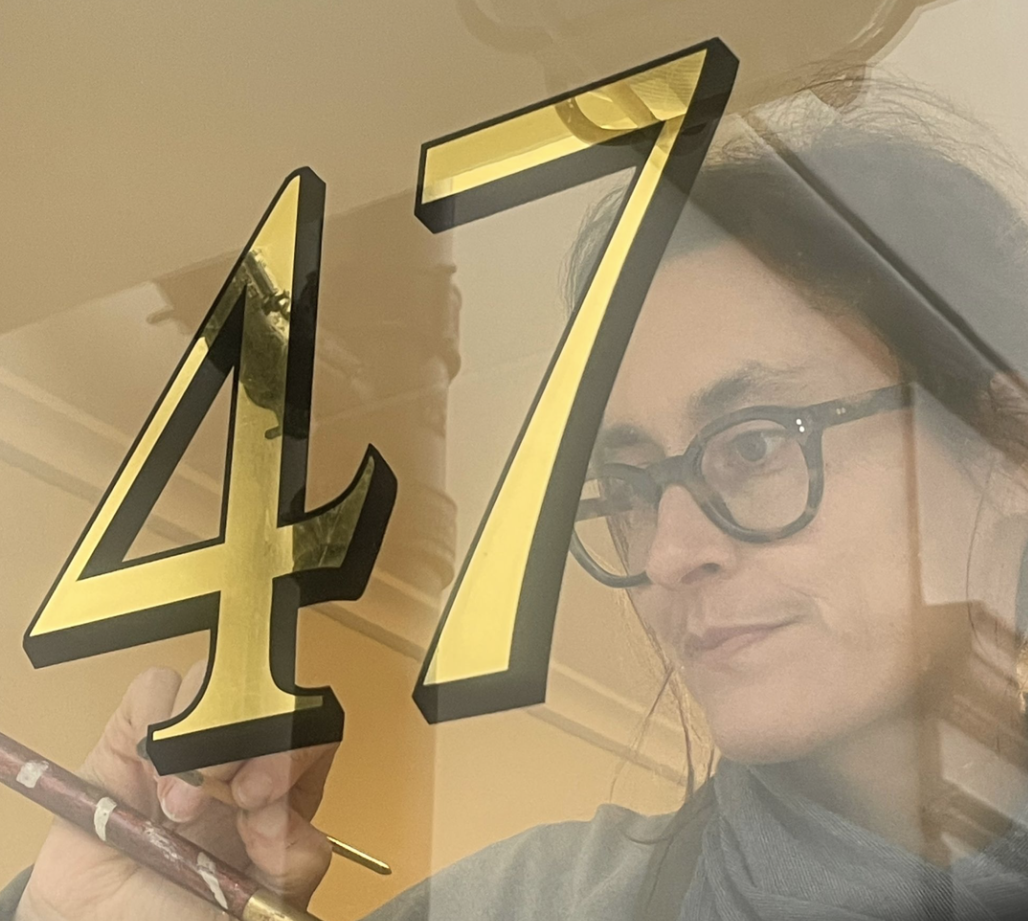
Below: Johnston Highbury Restored by NGS (2014 and 2021).
.
.
.
Brand designs reproduced by hand – digital layouts – design development – taking your sign brief to launch.
.
.
.
We are a ‘made in London’, bespoke design & sign writing service.
NGS Custom Typefaces & Fonts
.
.
.
.
Traditional Sign writer London
For Murals, Gilding,
Custom Typeface design, Brand design, Crafted Signs
.
.